当前位置: 首页 > 网络学院 > 设计教程 > 设计理念 > 教你如何设计Logo
A logo is more than a simple image, which is why I have made this tutorial.
因为logo不仅仅是一张简单的图像,它的重要性非常之大。因此,我们就书写了这篇教程。
After reading all through, you will comprehend every aspect of logo design, and you can start designing your very own logo!
当你通篇读完这部分教程之后,你就可以学会有关logo设计的每一个方面。到时候,你就可以自己设计属于你自己的logo了!
I'll try to keep everything as simple as possible.
我将用最精简的语言来描述每一个细节。
What is a logo?
什么是Logo?
A logo represents a company's identity. When people see that big mcdonalds "M" for example, they don't think "Wow that's one round big M!", they think "Hey, that's mcdonalds!"
logo代表的是一个公司或一个企业的标志。举个例子来说,当人们看到麦当劳的大大“M”的时候,他们不会想到这是一个大大“M”,他么会认为这是“麦当劳”。
On the internet, a logo plays an even more vital role, as it's often displayed in the header/banner, and thus viewable on every page.
在互联网上,logo担任着非常重要的角色。你可以发现,logo经常出现在标题、横幅或每张页面上。
Where do I start?
让我们开始学习吧
The first question you will need to ask yourself is "What does the company I make this for represent?" For example, a company that delivers mail might want to express speed, where other companies want to express reliability or style. There are a lot of different ways to go.
第一个问题就是,你需要问一下你自己:什么最能代表你的公司。举个例子来说,邮递公司的标志是:速递;那么其它的公司可能希望表达一种信任或其它风格。这里有很多方法可以使用。
Let's first decide the general lines of our logo.
首先,让我们先决定logo的主线。
There are three options at hand:
这里提供三个被选方案:
- illustrative (clearly illustrating what the company does)
具体图形(那种可以清楚表达公司内容的说明性图形)
- graphic (usually a logo including an abstract graphic, slightly illustrating what the company does but not as obvious as an illustrative logo)
抽象图形(一个logo通常包括一个抽象的图形,它可以微妙地表达公司的内容但不像具体图形那样直观)
- font-based (a logo with text only)
纯文本(纯文本内容的logo)
As an example, I will pick a mail company like I just mentioned. Let's call the company "cheetah". Cheetah is a mail company that especially focuses on being fast.
我将以我在上面部分提到过的邮递公司为例,具体讲解一下它的logo。让我们称其logo为“印度豹”吧。它可以表现出一种速度感。
I chose to do a graphic logo for this example.
我将选择图形logo为例给大家讲解。
Now, unless you have chosen to do a font based logo, you'll now have to brainstorm about what the company represents. Just write down the company name, what it does, and brainstorm on from there.
现在,除非你已经选择了纯文本logo,否则的话,你应该集中精力思考你公司最具代表性的东西。请写下你公司的名称以及所从事的业务,试着从这两个方面入手吧。
Like this:
像这样:
Cheetah (company) -> Fast, precise/exact, reliable, etc.
印度豹(公司)->快捷,迅速,精确/严格,可信,等等
Mail -> Personal, communication, social, etc.
邮递 ->个人的,交流,社会的,等等
Try to think of as many things as possible! You can always narrow down and scrap things afterwards, it's best to have more to choose from.
尽可能把所有你能想到的都想出来!那样就便于你以后缩小思考范围以及抓住重点。最好一开始就是多项选择。
Form
来源
What is the main form of the graphic going to be?
图形logo的最主要表现形式是什么呢?
Well most of the time it's pretty obvious. Apple's logo is an apple, and book-publishers naturally want a book in their logo.
大多数时候,它是显而易见的。“苹果电脑”的logo就是“苹果”;“书籍发行社”的logo通常是一本“书”。
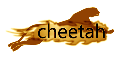
But it's not always this clear. Sometimes you have no leads to go on. In that case, go for something abstract. Try to create something unusual, something that catches the eye. Remember that we are only just making the form! Effects do not matter at this point, only think of the form like I did with my cheetah:
但是,这可能并不能清楚地表达出主旨。有时候你可能会迷失方向。这这种情况下,你需要添加一些更为抽象的东西。你可以试着去创建一些不寻常的、能够吸引人们眼球的东西。记住,我们只不过是在制造一种抽象的形态而已。得到的效果并不会影响这一点。就像我们制造“印度豹”这个标志一样,我们所制作的,只不过是一种形式上抽象的东西而已:

I made the cheetah jump upwards on purpose, as my company strives to become better, jump higher, for a brighter future.
我把“印度豹”的形象设计成向上跳跃,这意味着我的公司蒸蒸日上,将来前景一片光明。
As you can see this is just the basic form, and nothing more. This does not express the speed of my company at all.
就如同你看到的这样,上面的图案只是一个基本形式,别无它物。仅靠这张图案还是很难表达出公司索要诉求的速度感的。
Fonts
字体
The text is of course very important. It has to be both readable and catchy. You have two options:
文本内容也非常重要。它必须具有极强的易读性,并能够让人们立刻记住它。为实现上述这点,你有两个选择:
- incorporate your font with the graphic
将你的文字和图形结合起来
- set the text apart from the graphic, eg: beneath it.
将文字和图形分离,如:将说明文字放在图形的下方
It is often the best choice to do all letters in either in lowercase or uppercase.
最好是将所有的字母统一为小写或是大写。
Why? Because if you'd drag a box around it:
为什么要这么做呢?因为当你起草logo时,你便会发现下面的问题:
If all letters were upper- or lowercase only the text will fit perfectly in the box, where if one or two letters were uppercase, there would be a lot of unused space above the lowercase letters.
如果所有的字母都是统一为大写或是小写的话,那么整个文字可以协调的很好。如果其中的一个或是两个字母是大写字母,其余是小写字母的话,那么小写字母的上方空间就不能被充分地利用进去。
Now on to picking your font. There really isn't much advice I can give you here, it's almost impossible to explain what a font needs to be "good".
现在挑选所使用的字体。这里我实在是没用其它的建议可以提供给你了。因为到底什么字体是最好的,我也不知道。看你自己的实际感觉吧!
What you need to keep an eye on is that you'll be original. Don't use an very overused/whored font!
最好使用自己原创的自己。不要再去使用那些别人已经用过的字体。
Finish (1)
总结 (1)
It's time to incorporate the font with the graphic, and enhance the form further. Like I mentioned before, try to make it catch the eye.
接下来,该把文字和图形整合起来了,并且继续将形式进行扩展。就像我前面说过的那样,要把做的别致出众,能够抓住别人的眼球。

Color
颜色
Make sure you pick the right color! Most companies have their own corporation's style in everything. For example, in a walmart, every employee has a blue vest.
确保选择正确的颜色。大多数公司都有自己固定使用的样式和风格。比如,在沃尔玛超市,每个雇员都穿着蓝色的汗衫。
The color has to fit the rest of the company. Or the rest of the website, incase you're making this logo for a website.
使用的颜色必须与公司或网站的所有风格相适应,因为你是在为公司或网站制作logo。
I chose brown as my company's color, even though that's not common at all.
我选择了棕色作为公司的主色调,尽管这种颜色并不常用。

Finish (2)
总结 (2)
This is the final finishing up! Double check everything and see if you're happy with the result.
接下来,到了最后的收尾工作了。再检查一下,看看对自己设计的成果完全满意了吗?

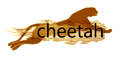
Here is my colored and finished image.
上面的这张图是我最终的设计成果。
As you can see I added lines to, even more, point out that this company wants to be fast.
在上面的logo中,你可以看到很多扫描线,这表示我希望公司邮递以及发展的速度越来越快。
It might not look much like a logo for a mail company, but that's because I chose for a graphic logo and not an illustrative one.
这看上去可能不太像一个邮递公司的logo,因为我使用的是抽象图形logo,而不是具体图形logo。
Once this logo is displayed on a mail-delivery van, it'll look slick.
当这个logo在邮递车体上展示出来的时候,视觉效果会很好。
 设计理念 中的 教你如何设计Logo


 评论 (0)