当前位置: 首页 > 网络学院 > 设计教程 > 设计理念 > 避免图形文件过量
 设计理念 中的 避免图形文件过量


 When designing a website, it's easy to start loading it up with graphics. While tempting, you have to resist -- otherwise, you'll end up with graphical overload.
当设计一个网站时,一般都会很喜欢先装载图形文件。当你尝试这样做的时候,你必须先忍耐,否则的话,你就应该马上终止使用过量的图形文件。
Why is that a bad thing? Here's why.
为什么不要过量使用图形文件?下面就是原因所在。
It Takes Too Long to Download
导致下载时间过长
The first reason to cut down on graphics is that the more there are, and the larger they are, the longer it will take each of your pages to download. People are impatient when waiting for pages to download -- you only have around 5 seconds before your visitor hits the Back button.
避免使用过多的图形文件的第一点原因就是:如果图形文件过多,或过于庞大,那么每张页面的加载事件就会越长。人们没有那么多的耐心等待页面加载,他们一般等待5秒钟以后便会点击返回按钮。
What can you do about this? Apart from using fewer pictures, you can also make sure that you resize your images in a graphics editor. This actually makes their file sizes smaller. If you just resize images by specifying a width and height in HTML or CSS, they will still be slow to download because the full file size is being used.
那么针对这点,你可以做些什么呢?除了使用更少的图形文件外,你还可以使用图形编辑器重新调整你的图形大小。这样做可以真正地减少图形文件的尺寸。如果你仅是通过使用HTML和CSS来指定图片的宽度和高度,那么图片下载起来还是会很慢的,因为图片的实际大小并没有更改。
You should consider turning on compression in your image editor. JPEG files can often be compressed by up to 25% before there's a noticeable difference in quality. Try different formats and compression levels to see what works.
你应该考虑使用图形编辑器来压缩你的图形文件。JPEG文件可以将图形文件压缩到25%而保证一个极低的失真度。你应该尝试使用不同的格式和压缩水平来测试实际效果。
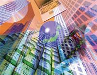
It Gets Too Busy
它会使整个站点的工作变得更加繁忙
If you use a site with more than 4 images on the page at once, your eyes are being pulled all over the page. They're not sure where to focus because the page simply has too much going on.
如果一旦你在一张页面上使用超过4张图片,那么你会感到眼花缭乱。能不能确定该集中观察哪些地方,因为页面上有太多的东西了。
Look at the front pages of newspapers, and notice how they lead on 1 picture. Putting 2 pictures on a front page is considered to be poor: the reader doesn't know where to look.
看看报纸的头版,看看他们是怎样放置着一张图片的。在首页放置两张图片可能就会带来麻烦:阅读者会弄不清楚到底该从何处阅读。
That goes double for websites, where the viewable area is much smaller than a newspaper page. Even if you have more than 1 thing to say, it's better to 'go large' with 1 picture and then explain the other things in text, next to or below it.
相对于报纸来讲,网站的可视化区域就更加稀少了。即使你要表达的事物不止一件,那么你也最好只放置一张图片,然后在这张图片的旁边或者下方用文字来补充说明。
It Distracts from the Content
不能使阅读者专注于阅读文本内容
Users visit your site to get information, not to look at your graphics. Too many graphics will distract from your content, or, worse, force readers to search for it. Any time your graphics get in the way of people readily using your site, you're suffering from graphical overload. And that is a bad thing.
用户访问站点的目的是获取信息,而不是查找图片。过多的图片会分散他们阅读文本内容的注意力;或者,更糟的是,会使得用户对站点信息无从查询。任何时候,当你放置的图片阻碍了用户对你站点的正常使用,那么,你的站点就面临了图片过量的境地。这并不是一件好事情。
What's the solution? Simply decide which of all those graphics are really necessary. Remember, don't add graphics just to look nice, each graphic must have a specific purpose.
那么,解决方案是什么呢?先简单地看看,所有这些图形是否是必须的。请记住,不要为了网站的美观而肆意添置图片。放置的每张图片都应该能够物尽其用。
An Exception: Photo Galleries
这里有一个例外:相册
If the purpose of your site is photo presentation, then clearly multiple images are appropriate. However, don't just stick up several large photographs -- provide thumbnails: smaller versions of each image. If interested, the visitor can click on 1 to make it larger.
如果你的站点纯粹是一个与相册相关的站点,那么清楚地放置各类图片是合适的。然而,不要专注于放置那些过大的照片图片,尽可能地放置那些精致的小图片:先放置小图片,如果访问者兴趣的话,可以点击这张小图片来显示对应的大图。
This fits more pictures on each page, and avoids wasting user download time and your bandwidth.
使用这个方法可以在每张页面上放置数量庞大的图片集,同时也不会浪费用户的下载时间和你的网站带宽。
Keep in mind that in all web design, the images are there strictly to support the content. Even when the content is graphical.
请永远地记住,在你所进行的所有网页设计中,放置的图片一定要严格支持内容。即使整个网站的内容是以图片宣传为主的。
 评论 (1)