当前位置: 首页 > 网络学院 > 设计教程 > 设计理念 > 避免出现用户不易操作的下拉菜单
On many sites, drop-down menus aren't a significant part of the design. However, they appear often enough that they deserve some attention. So exactly how should they be used?
网站设计中,下拉菜单作用并不重要,然而却经常出现。我们应该如何运用下拉菜单呢?
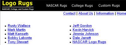
For an example of the kind of drop-down menus I'm referring to, check out the four menus at the top of this site: Logorugs.net. Just as a slight clarification, drop-down menus (little boxes that are usually white) are different from fly-out menus used in some navigation bars. Although there are several similarities between the two, we'll focus specifically on drop-downs.
Logorugs.net网站上方出现了四项下拉菜单。需要说明的是,下拉菜单与导航条中的飞行菜单有所不同,尽管两者之间有相似之处。下面我们主要介绍下拉菜单。
Drop-down boxes naturally attract visitors' attention, because they are a recognizable tool and because they represent something to do. However, even though visitors are attracted to them, they are a tricky thing to use. There are several reasons for this.
下拉菜单可以吸引用户注意力,因为他们具有可辨认性,并且包含用户需要操作的内容。然而,即使下拉菜单吸引用户的注意力,但菜单操作会很复杂,访问者可能因此产生厌烦情绪。下面介绍原因。
First of all, drop-downs hide the available options most of the time. Visitors have to click in the box before the options will display. This is inconvenient, as the options aren't readily available. This is especially a problem if the box isn't clearly labeled, because visitors won't even know what type of information they'll find if they do click in the box. Visitors are very good at ignoring anything they don't understand.
首先,下拉菜单经常隐藏可利用选项。用户必须点击菜单栏,才能浏览到各种选项。由于选项没有清楚罗列,所以用户不方便进行操作,尤其是当菜单不清晰时,用户不能了解点击之后呈现什么内容。访问者会忽略不易理解的内容。
Also, drop-downs require a bit of mousing precision. A long list of choices can be especially problematic. Visitors often accidently select the wrong choice because it's difficult to hit the desired option precisely. This can be confusing, particularly if the visitor doesn't realize he or she made a mistake.
同时,下拉菜单选项需要精确、细致。罗列许多选项会给用户带来一些问题。由于选项过多,访问者经常选择错误内容,会产生困惑,尤其是访问者没有意识到已经犯错误的时候。
If there are only a few options in the list, the problem is somewhat lessened. However, if there aren't very many options, it shouldn't be a problem to list them individually on the page. This avoids the difficulties altogether.
如果仅有几个选项,这个问题就会减轻,然而如果选项少,就可以在网页中单独罗列,这样能够避免
所有问题。

On Logorugs.net, drop-down menus are used for the site's primary navigation. This creates an extra complication: Drop-down menus aren't a standard form of primary navigation. Any time your site doesn't stick with the common conventions, your site becomes less usable to visitors and you elevate the risk of confusing them. It helps somewhat that the site is very simple and uncluttered, but the problem still remains.
在Logorugs.net网站中,下拉菜单用作导航系统,这样情况更复杂:下拉菜单并不是标准的导航系统格式。如果使用非常规的导航系统,网站可用性会降低,用户会产生迷惑。即使网站更简单、美观,但问题仍然存在。
Additionally, the last two menus on this site aren't clear about which options are "clickable". It appears that the first option in the list can be clicked, but in reality, it's merely the name of the category and doesn't go anywhere.
此网站的最后两个菜单没有明确说明可以链接的选项,看上去第一个选项可以进行链接,但其实,它只是一种类别名称,并不能进行链接。
Finally, the last menu has only one option. Never use a drop-down menu that contains only one choice.
结尾的菜单只有一个选项,下拉菜单应该避免出现一个选项。
With this site, it would be better to add an additional navigation bar with links to the four main categories. Each of these links could lead to a page containing the sub links. This menu should be present on every page of the site, so visitors can easily get to any category. On the main page, the main content area should be used to list the major categories and show the links under each category. This way, all the options would be instantly visible when visitors first enter the site. This would also be more helpful to visitors than the long paragraphs of copy that currently occupy center stage. It's better to use primary screen real estate to spotlight the company's products than to talk about the company.
这个网站最好出现能与四大类别内容进行链接的导航条,所有链接都能够进入包含二级链接的页面。所有页面都应该出现这个导航条,这样访问者可以方便地浏览各种内容。首页的主要内容区域应该罗列各大类别以及与各大类别的链接。这样,用户登录网站后,可以立即注意到各个选项,更容易进行网站操作(相对于大段文字内容)。网站主要区域应该罗列产品信息,而不是公司信息。
It is occasionally appropriate to use drop-down menus for other functions when nothing else is available. However, you should first explore other options and see if there is a solution that will be more user-friendly.
网站如果不提供其它内容,可以使用下拉菜单,发挥其它功能。然而,使用下拉菜单之前,首先考虑是否存在其它解决方案,更方便用户操作。
 设计理念 中的 避免出现用户不易操作的下拉菜单


 评论 (0)