当前位置: 首页 > 网络学院 > 设计教程 > 设计理念 > 网站设计避免出现8大错误
 设计理念 中的 网站设计避免出现8大错误
出处:互联网 整理: 软晨网(RuanChen.com) 发布: 2009-03-01 浏览: 2242 ::

收藏到网摘: n/a


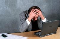 The following eight tips aren't meant to offend, but to teach. I want to help you avoid the same terrible web design mistakes that I made in my first few months online. And, believe me ... when I look back on some of MY first pages, I CRINGE with repulsion!
我开始进行设计时,曾经犯过以下8种错误,这篇文章将会介绍避免这些错误的方法。现在回头浏览第一次设计的网页,我都感到羞愧。
So brace yourself -- these could get kinda ugly.
但这些丑陋的网页能激励设计者不断追求进步。
DISASTER #8: Center everything down each page.
错误NO.8:所有内容居中。
Centering ALL of your text makes it VERY hard to read, and even harder to pick out the important points. And, other than that, IT'S TACKY!
如果所有内容被放置在网页中心,文本就会难以阅读,浏览者也很难找出重要内容,并且网站外观也会很糟糕。
DISASTER #7: Include at least 50 banners on each page.
错误NO.7:每张网页出现50个横幅。
I, for one, am impatient. That makes me only one of THOUSANDS of Web surfers that simply WILL NOT WAIT for your banner-laden pages to load. When I visit a site and even see OUTLINES of tons of banners on the home page, I'm on the fast track to a DIFFERENT site. The statistics are true -- you're losing valuable visitors.
很多网站浏览者像我一样,没有耐心等待包含大量横幅的网页下载。登录网站后,如果看到主页到处都是横幅,我会立即退出网站。这种网站会不断流失有价值的访问者。
DISASTER #6: Make all of the text H - U - G - E.
错误NO.6:网页中的文本内容太多。
Assuming at least 50% of the population HAS 20/20 vision, I doubt that this is necessary. It makes your text hard on the eyes, and your pages look less than desirable.
你认为网站访问者会浏览所有内容吗?我认为不会。如果内容太多,网站访问者反而难以浏览,眼睛会产生疲劳感,网页外观也会很糟糕。
DISASTER #5: Use backgrounds with at least three bright, clashing colors.
错误NO.5:网页背景颜色至少出现3种,并且颜色明亮、重叠。
Super-retro, clashing patterns and colors make your text hard to read, no matter WHAT color the words are. And, those wavy lines in the background make our heads vibrate. This is NOT "The Groovy Sixties," people. PLEASE spare us -- we need our eyesight for other things!
不管内容颜色如何,明亮、搭配不和谐的背景颜色会使内容难以浏览。背景中如果出现波状线,访问者会更头痛,所以避免出现这些元素,确保访问者快捷、顺利地阅读内容。
DISASTER #4: Have absolutely NO way to contact you at all on your site.
错误NO.4:没有出现联系信息。
If your visitors have questions about the services, products, or resources you offer, they're going to need a simple way of getting in touch with you -- an e-mail address at the VERY least. We won't be happy if your long distance number is the only means of contact on the site.
如果访问者对网站服务、产品或者网站信息提出疑问,就需要与网站联系,所以网站需要提供联系信息,至少提供电子邮件地址。但最好不要出现长途电话号码,否则用户会不高兴。
DISASTER #3: Don't put your name ANYWHERE on your site.
错误NO.3:网站没有出现你的姓名。
Realistically, you're making visitors feel like Neanderthals when they have to send an email addressed, "Dear ... You." If you want us to trust you enough to buy from you, you'll need to disclose a bit more info than that! Employees of major corporations wear name tags, or have name plates on their desks. An Internet business should be run no differently.
实际上,访问者发送电子邮件时,如果出现"Dear ... You.",他们会感觉自己很没有礼貌。如果想得到用户信任,你需要透露更多信息。大型公司的员工会佩戴员工证,开会时会拥有自己的姓名牌,网站营销也应该这样。
DISASTER #2: Plaster things on your site that have NOTHING to do with its theme.
错误NO.2:网站出现与主题无关的内容。
If a visitor comes to your site after doing a search on Lycos for "free marketing tips," then by-gosh... that's what they'd better find. They didn't come to see the Amazon.com fishing books showcased on your home page, nor did they come to bid at an auction on the One-and-Only Network! Stick to your theme like white on rice. (Please forgive the cliche'. )
如果访问者通过在搜索引擎中搜索“免费营销技巧”,登录你的网站,但他们并没有在主页中找到Amazon网站的营销内容,也没有找到One-and-Only的拍卖内容,访问者会怎样呢?当然会离开。网站内容要切题,不要出现陈词滥调。
And, the number one "Webmaster disaster" that'll send your visitors howling is...
排在第一位的错误是:
DISASTER #1: Have whirling, spinning, farting, bubbling animations on every page.
Putting animated bullets next to important text is the WORST thing any Webmaster could do. This does absolutely nothing but distract your visitor's eyes away from the info that was intended to get them to subscribe to your newsletter, or buy your products.
错误NO.1:所有网页出现动画图像。网站最要避免出现的元素就是:重要文字内容旁边出现动画图像,这样只会转移用户对有价值信息的注意力,这些有价值信息很可能会引导用户定制时事通讯,或者购买产品。
 评论 (0) All
