当前位置: 首页 > 网络学院 > 设计教程 > 设计理念 > 内容简约的网页设计
 设计理念 中的 内容简约的网页设计
出处:互联网 整理: 软晨网(RuanChen.com) 发布: 2009-03-01 浏览: 3544 ::

收藏到网摘: n/a


With the increased affordability of web space and bandwidth, the growing use of high speed modems, and the abundance of implementation technologies like Flash, audio and video, comes the temptation to overuse them in web page design.
随着网络空间和带宽担负能力的增加,调制解调器速传输速度的提高,以及网站设计工具的大量出现(如:flash、音频、视频),网站设计中出现了过度使用上述技术的现象。
One important characteristic that has always differented good web designers from bad ones is the restrain in embracing every new technology that comes along. Good designers focus first on functionality (making sure that the web page achieves the objectives for which it was created) while bad designers rush to make gratuitous use of elements like graphics, flash animations and javascript, just "because they can" or because "it looks cool".
区分网站设计师水平高低的一个重要因素就是:设计网站时,是否避免使用新技术。好的设计师首先考虑网站的功能,确保网页能实现预定的目标。然而,水平低的设计师会在网站中大量运用图片、flash动画以及JS,因为他们觉得这样的页面具有可观赏性。
Today, approximately ten years after the Internet started its exponential growth, and in spite all the technological developments, minimalist web page design still wins big over fancy, flashy, confusing design.
现在,因特网快速增长的时期已经过去十年了。尽管技术在不断发展,但布局简单的页面比令人眼花缭乱的页面更加吸引用户。
"Minimalism" is an term coined in the art and literature circles to describe a movement towards extreme simplification of form and color. Extrapolating the concept to web pages, it refers to layout, color scheme and other presentation aspects, to which the usability dimension has been added.
“极少主义”是在文学与艺术领域经常出现的一个术语,意思表示追求最简单形式或者最简单色彩。把这个术语延伸到网页制作中,是指布局、色彩设计以及其它表现形式,在增加网站可用性的同时,要尽量追求简单。
Minimalism is functionality and esthetics working together. In web design, minimalism involves removing all unnecessary frills, focusing on the user, and creating an interface that is at the same time pleasant to the eye, easy to navigate, intuitive, and effective in helping the user achieve his goals quickly and effortlessly.
简约的网站也要具备功能性与观赏性。在网站设计中,极少主义要求去除所有不必要内容,以用户为中心,设计出吸引眼球、操作简单的网站,可以帮助用户方便、快捷地找到需要的内容。
Minimalism applies to many aspects of web design. For example:
极少主义可以应用于网站设计的很多方面。例如:
The actual coding of the pages: when it comes to writing code for web pages, the use of cascading style sheets is a good exercise in minimalism; by concentrating the style definitions in one external file and then linking to it from each web page, we reduce the amount of code in each page, and, as a consequence, the pages will be smaller, will load faster, and will be easier to maintain.
网页的有效编码:在写网页编码时,利用CSS可以保证出现最少的编码;把样式说明集中在一个外部储存器中,然后与所有网页连接,这样就减少了每一张网页的编码,因此,网页会变小,下载速度会提高,并且网站也更容易维护。
The use of graphics: To use graphics only when absolutely necessary is another good example of minimalist web design. Graphics should add value to what is being presented, instead of being just decoration. Also, graphics should be optimized and be as lean as possible. Using relevant graphics, and using them sparingly, will eliminate clutter on a page, will make the content easier to understand, and will allow for quick page downloads, giving users what they want, faster.
图片的利用:只有在非常必要时,才能使用图片,这是简约网站设计的另外一个例子。图片的作用不应该是装饰,而应该是增加网站的价值。选好图片以后,把图片进行优化,图片尺寸要压缩到最小。尽可能少运用与内容相关的图片,这能改变网页的混乱布局、确保内容的易理解性以及减少下载时间,让用户快速找到需要的内容。
The use of color: good web designers use color to separate the page into different categories, and to emphasize what is important. For example, each section of a navigation menu can be given a different color to indicate that the tasks are related. Also, the use of bright colors for buttons that we want users to click is a good way to emphasize the importance of that task. If everything on a page has color, nothing will be emphasized and the page will be a mess.
色彩的运用:好的网站设计者利用图片把网页分成不同的部分,并且把重点强调出来。比如说,导航菜单的各部分运用不同的颜色,这样表示不同的内容;同时,我们可以利用明亮的颜色装饰希望用户点击的按钮,以此来强调内容的重要。如果网页所有内容都有颜色,会使页面混乱,没有重点可循。
The use of ample white space: some web pages resemble those car dealership ads that we see in the Sunday paper: they're so busy and chaotic that they make us want to scream.
空白区域的利用:有些网页就像Sunday上的汽车广告:内容拥挤、混乱,给人压抑的感觉。在电脑屏幕上阅读文章很难,所以网站布局要尽可能让访问者感到舒服。我们可以利用空白区域把网页分成不同部分,来改善内容的易读性。访问者越舒服,在网站停留的时间就越长。
Legible and big-enough fonts: minimalism doesn't mean making your fonts as small as possible. A good, minimalist page should use a screen-friendly font, like Verdana, in a big enough size to be read effortlessly. Also, the number of font types per page should be limited to two or three: one for the headlines, one for the copy and possibly a third one for the navigation buttons. That's it. The use of more fonts will make the page look busy and unattractive.
清晰、适当的字体:极少主义并不是要求字体尽可能小。美观、简约的网页应该使用适合屏幕的字体,例如:Verdana;同时字号要足够大,便于用户阅读。每张网页字体数量控制在2-3种:标题一种,内容一种,如果可能导航菜单一种。这样就可以了,如果出现过多的字体,网页内容会显得紧凑、不美观。
Search Engine Optimization: search engines don't recognize images. They recognize text. Text is the favorite food of search engine spiders. Search engines also have trouble with Flash and Javascript. If you want your pages indexed quickly and have a better chance of doing well with the search engines, remember to design them with minimalism in mind: keep things simple and reduce as much as possible the use of Flash, Javascript and images.
搜索引擎优化:搜索引擎不会搜索图片,但会搜索文字,搜索机器人最喜欢文字内容。搜索引擎在搜索Flash和JS内容方面也存在问题。如果你想搜索引擎快速对网页做索引,并且有一个好的排名,就要用简约的方法设计网页:内容简单、尽可能减少Flash、JS以及图片内容。
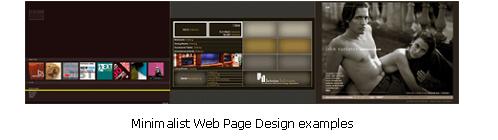
By now you may already have a good idea of what we're talking about. To illustrate it, we would like to conclude by presenting a random list of links to pages that we like, which have been designed with a minimalist web design approach:
现在,你可能已经明白了我们讨论的内容。下面,我们随意列举一些利用简约方式设计的网页,来结束这片文章:
Hewlett Packard ( http://www.hp.com )
Key Bank ( http://www.keybank.com )
In-Formation Design ( http://www.in-formation-design.com/services.html )
Nitrogen Interactive ( http://www.nitrogen.net.au )
Apple ( http://www.apple.com )
Jongrah Graphic Design ( http://www.jongrah.com/index.cfm )
Paypal ( http://www.paypal.com )
Interspire Software ( http://www.interspire.com )
Clean Page Marketing and Advertising ( http://www.cleanpage.com )
Newark1 Web Design ( http://www.newark.com )
Affinity New Media ( http://www.affinitynewmedia.com )
Kianta Web Design ( http://www.kianta.com )
Lancome ( http://www.lancome.com )
Hilton Harbor ( http://www.hilton.org.uk )
Nylon Technology ( http://www.nylontechnology.com )
Novastar Mortgage ( http://www.novastarmortgage.com )
 评论 (0) All
