当前位置: 首页 > 网络学院 > 设计教程 > 设计理念 > 文本与图片,哪项内容更重要?
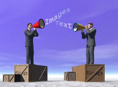
What's more important to your web site: pictures or text? If you have an ecommerce web site, you need the answer to that question. Your profits depend on it.
图片与文本,哪项内容更重要呢?如果拥有商业网站,你需要回答这个问题,因为这关系到网站收益。
Over the years, we've heard a lot of opinions on this topic. Some webmasters formed opinions through studying log files and conducting online surveys. Others relied on personal preference.
多年来,对于这个问题的争论很多,有些网站管理员通过研究系统记录文件,进行网上调查,总结出自己的观点;而其他人则根据自己的偏好,权衡两者的分量。
However, thanks to
然而,在斯坦福大学,poynter研究所的帮助下,我们对如何设计最有效的网站进行了具体的研究。我们研究的主要问题是网站访问者如何浏览网站。
Some will find the results surprizing. Others will have their opinions confirmed. The four-year study demonstrated that our online reading patterns are the precise opposite of our reading patterns when we read newspapers or magazines.
有些人可能会改变固定观念,有些可能会坚持自己的观点。四年的研究证明,网站用户的浏览习惯与报纸、杂志读者的阅读习惯相反。
When we read print newspapers, we read at the breakfast table, in the coffee shop or on the subway. We browse -- a headline here, a picture there. We look at the pictures first, then read the text if it interests us. People who layout print publications know this, and they design accordingly.
当我们在咖啡店或者地铁中阅读报纸时,我们首先阅读内容提要,浏览标题,图片。我们会首先浏览图片,然后阅读我们感兴趣的内容。报纸编辑会根据我们的阅读习惯,进行内容编辑。
Many concluded that the same patterns would apply on the web. But it's not so. We do the exact opposite.
很多人认为网站设计也可以这样,但事实却相反。
Surfing isn't a casual activity that we do comfortably while waiting for the bus. It's something we do sitting in a chair staring at a monitor that isn't friendly to the eyes. Moreover, we're likely to be distracted by telephone calls, incoming email and co-workers in the next cubicle.
网上浏览并不是我们等公车时,舒适、随意的浏览行为,而需要我们坐在椅子上,盯着显示器。在浏览的同时,我们可能会受到电话、电子邮件或者隔壁同事的打扰。
Online, we need to get the information as quickly as possible. We head straight for the text. The study found that surfers look first at article text (92% of the time) and briefs (82% of the time), and thirdly at photos. We read 70% of the article, as compared to the 30% we're likely to read from a magazine or newspaper. Then, when we're finished with the text, about 22% of us glance at the web site's pictures.
在网上,我们需要尽快获取信息,会首先阅读文字内容 。研究发现,网站访问者首先阅读文字内容(92%的时间),其次阅读摘要(82%的时间),最后浏览图片。我们会浏览70%的网站文字内容,然而我们只会浏览30%的报纸、杂志文字内容。文字内容浏览完毕后,22%的用户会浏览网站图片。

Banner ads and photographs attract more attention than artwork.
横幅与照片更能吸引用户注意力。
Oddly, the study also showed that although only 22% of site visitors glance at pictures, 45% check out banner ads for approximately one and one quarter second.
奇怪的是,尽管22%的网站访问者会浏览图片,但45%的用户只利用1秒或者1秒半的时间。
Other miscellaneous findings from the study:
研究得出的其它结论:
1. Sports readers read more content than any other type of reader. Males and females read sports in equal numbers, but 11% of males read heavily compared to 0% of the females.
1.体育新闻读者比其它读者阅读的内容要多。男性与女性体育新闻读者数量大体相同,但11%的男性读者会深入阅读。
2. Thirty-year olds read more local content than twenty year olds or sixty year olds.
2.与二十几岁、六十几岁的读者相比, 三十几岁的读者会阅读更多本地新闻。
3. Females read more local content than males.
3.相对于男性读者,女性读者会越多更多本地新闻。
4. Twenty-year olds read more science and sports than other age groups.
4. 相比于其他年龄段的浏览者,二十几岁的浏览者会阅读更多的科学、体育信息。
5. When reading online, we read serially. That is, we jump back and forth among sites, returning to the ones that interest us.
5.我们可以连续阅读网上的内容,也就是说我们可以不断转换网站,直到找到自己感兴趣的网站。
So what conclusions can we make from the Stanford Poyntner Project?
那么我们从这项研究中可以得到什么结论呢?
First, we must consider that these researchers studied the online behavior of a small group of Americans who routinely access news web sites. More research is needed to determine whether the results will generalize to international readers, or to users of ecommerce web sites.
首先,我们必须想到这项研究仅仅是针对小部分经常浏览网页的美国人。至于其它国家的访问者、电子商务网站访问者会不会这样,还有待研究。
Critics of the research argue that the results are less significant when applied to people who are accessing the web with high bandwidth connections. However, although high bandwidth is making gains in North America, many people, both in
这项研究的批评者认为,研究结果对于利用高速宽带上网的用户来说,意义很小。然而,尽管现在很多宽带用户,但全世界仍然有很多利用电话拨号或者利用无线装置上网的用户。
That being said, the following conclusions seem logical:
也就是说,下面的结论看上去合乎逻辑:
- Text is important. It's words that hold the attention. Give visitors the information they need, and present it well.
文本很重要,是吸引用户的内容。合理设计文本信息,便于访问者浏览。
- Use eye-catching headlines and sub-headlines. Remember, over 90% of your visitors glance here first.
运用醒目的标题与副标题。请记住:90%多的访问者只是匆匆浏览网站内容。
- Although few click on the banner ads, the one-second glance will generate an impression that can help with branding.
尽管网站用户很少点击横幅广告,但一秒钟的注视,绝对可以产生一种印象。
- One second doesn't allow time for visitors to view rotating animations in banner ads. It's better to put the full message, including your logo, in each frame of the animation.
一秒钟的时间不允许访问者浏览横幅广告中的动画内容,所以你最好把全部信息(包括logo)放入动画框架中。
- Pictures are still important, but use sparingly. Pictures and animations that distract the viewer from reading the text are counter-productive.
图片虽然也很重要,但需要节约使用。分散浏览者注意力的图片以及动画图像会产生相反的作用。
 设计理念 中的 文本与图片,哪项内容更重要?


 评论 (0)