当前位置: 首页 > 网络学院 > 设计教程 > 设计理念 > 拒绝使用的七种logo样式
 设计理念 中的 拒绝使用的七种logo样式
出处:互联网 整理: 软晨网(RuanChen.com) 发布: 2009-03-01 浏览: 2270 ::

收藏到网摘: n/a


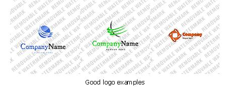
Your logo is the visual personality of your business and as a first impression; your logo essentially is your business! A professional logo is one of the fastest way to build credibility. If you sell quality products, your logo should reflect this. Likewise, a poor quality logo suggests inferior products. If you can successfully avoid these common logo blunders and you are well on your way to a great logo:
logo是企业的视觉形象,是客户识别公司的开始,从本质上说,logo代表企业。专业的logo可以帮助公司尽快建立信誉度。专业的logo代表着产品的优质;相反,糟糕的logo暗示着产品的劣质。如果能够成功避免logo设计中的错误,你的logo会发挥强大的作用。
1. The Clipart Logo - Most clipart images are widely distributed. Anyone who is familiar with the software providing the clipart will very likely recognize your ‘borrowed' logo. This is a poor way to build credibility for your business.
脱离主题的logo——许多脱离主题的图片分布在网站上,对提供clipart软件的程序熟悉的用户不喜欢这种虚构的logo,这样的logo不利于建立企业的信誉度。
2. The Special Effects Logo - Strip away all of the special effects to get at the heart of your design. Special filters such as glows, drop shadows, and bevels are great for creating graphics and manipulating photos, but they can be very distracting when applied to a logo. A great logo should be able to stand its ground in black and white, without any effects.
古怪特效的logo——去除所有特殊技巧,直达设计主题。像亮光、阴影、斜面这样的渗透方法可以应用在图像和照片中,但在logo中使用,会使主题分散。好的logo应该在黑白色背景下形象完美,没有其它影响。
3. You may like to consider drafting your concepts on paper first. You should think more about what is being presented before you decide how it is presented. When you are pleased with a one-color concept then go to the computer and recreate it digitally. At this point you may or may not like to add a subtle effect to enhance your logo for web use. Eliminate any effect that does not add value to your design.
你可能会先在纸上进行构思。在决定如何设计之前,多想一想你会呈现什么内容。当想到一种颜色的时候,在电脑上设计出来。这样,你可能会决定是否在logo上添加内容,以增强logo的功能。去除logo中没有价值的内容。
4. The Banner Logo - A logo is not a web banner advertisement. You are doing yourself more harm than good by forcing your logo into a banner shape, especially if the content is crammed to fit the entire rectangle. Our eyes are trained to avoid these shapes, not read them.
横幅logo——logo不是横幅广告,如果让logo以横幅的形式出现,这样对网站造成的消极影响大于积极影响,特别是当内容设计成矩形的时候。我们的眼睛不会去注意这样的内容。
5. The Integrated Logo - Professional logo designers occasionally integrate graphic elements directly into the text to create one unified logo. This process is difficult and risky. Executed poorly, your logo can easily look ‘tacky' and illegible. (i.e. using the letter ‘O' in the company name to create a globe, eye, magnifying glass, etc.) If you are new to graphic design, stick to a top centered or left graphic layout.
组合logo——专业的logo设计者有时会把图片整合到文章中,设计组合的logo。这是一个困难且冒险的过程。如果设计不好,logo会显得俗气、难看,比如说,把公司名称中的字母O设计成地球、眼睛、放大镜等。如果你对图片设计还不是很熟悉,你可以把它们放在上端中心位置或者左边。
6. The Text-Only Logo - A text-only logo severely restricts the ability to express your company's uniqueness and memorability. Larger, more established businesses can pull off text-only logos with exorbitant marketing budgets. One test of logo's effectiveness (marketing budget's aside) is to alter the letters and see if your logo is still recognizable. If not then you need to seriously consider a visual element. If you just can't resist a text-only logo, consider a strong, unique typeface - preferably custom made.
纯文本logo——这样的logo不能显示出公司的独特性和难忘性。大型、悠久的公司可以运用纯文本logo,因为他们有大笔营销预算费用。有一个对logo功能的测试(不考虑营销预算)是这样的:改变字母,研究logo是否仍然易辨认。如果不能,那你有必要认真考虑一种视觉元素,如果你坚持使用纯文本logo,你可以考虑使用强烈、独特的字体——最好是常用的。
7. The Monogram - Monograms (company initials) are very difficult to use effectively. It will take a long time to build credibility with a monogram logo. Similarly, logos consisting of several overlapping letters generally do not work well. They may be fun to construct, but the end result says very little about your company and your products/services.
字母组合logo——利用好字母组合(公司名称开头字母)很难。利用字母组合logo,需要花费很长时间才能建立公司的信誉度。同样,由几个重叠字母组成的logo一般也不会发挥很大的作用。可能设计出来会很有意思,但结果是,没有几个人会关注你的公司、产品或服务。
8. The Complex Logo - Detailed illustrations, photos, and complex layouts make poor logos. Each additional detail is an extra detail that your (potential) customer has to remember. A simple, unique logo with solid shades and minimal lines will have greater impact and memorability.
复杂的logo——详细的说明、照片以及复杂的布局会使logo显得很糟糕。每一条额外信息都需要客户(或潜在客户)阅读。一个带有固体图案和简短语句的logo,既简单又独特,可以产生巨大的吸引力。
About the Author:
关于作者:
Craig Fraser is a Logo Specialist and Creative Director for Flame Media Design, Flamedesign.ca
Crain Fraser, logo设计专家、Flame Media Design的创意总监,你可以登录Flamedesign.ca网站,欣赏他的作品。
 评论 (0) All
