当前位置: 首页 > 网络学院 > 设计教程 > 设计理念 > 无数字理念
I would like to depart for this week, and maybe longer, to discuss some inspirations outside of the digital realm. Actually, I just want to talk in particular this week about someone who continues to be a great inspiration for me an to many others in the field of design.
从现在开始,我们会用一个星期,或者更长时间来讨论数字领域之外的一些理念。在这一个星期时间中,只是讨论某个人,他带给我和许多其他设计者新的设计灵感。
When I use the term "design" I mean exactly that. I am not talking in a context specific way here, but rather in reference to ideas surrounding anything thought of and made. This includes graphic art, consumer products, software, architecture etc... The principles behind all of these thing are interchangable for the most part.
运用“设计”这个术语的时候,我的确切意思是这样的。这里我不会谈论问题的具体做法,只想介绍一种思考和解决问题的思想。绘画、产品、软件、以及建筑等都需要进行设计,大部分艺术形式的设计原理是通用的。
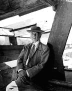
One of the greatest architects of the 20th century, if not ever, is a man named Frank Lloyd Wright. Many of you have probably heard of him. Wright was an architect, who was very visible during the first half of the 20th century. He was arrogant, brash, rude but he was also brilliant. Seems typical of someone with a strong vision.
Frank Lloyd Wright是20世纪最伟大的建筑师之一,相信你们大多数人听说过他。20世纪前半期,Wright是一位很有远见的建筑师,虽然傲慢、自大、粗鲁,但是才能非常出众,是典型的有远见力的设计师。

The reason I bring him up, is because I think the parallels between what Frank Lloyd Wright did for architecture can apply to web design as well. Wright's ideas about architectural design were extremely new. Every detail of his works was planned out to evoke emotion, comfort, art and of course function. His radical approach was criticized by many. But one of the things about being a genius, is the ability not only to envision an entirely new paradigm of thought, but to make it extremely functionally sound. When I say this, I mean that the idea evokes a familiar sense of meaning, but it a whole new light. This could be true for any medium of expression as well. Anyone can come up with a new idea. But to come up with a whole new paradigm, that can shift peoples understanding about something fundamental is what genius truly is.
在这里提到这个人,是因为我觉得他在建筑方面的一些理念可以应用到网站设计中。Wright的一些建筑设计方法非常新颖,他的建筑作品中,每一个细节都能调动观赏者的感情,能让观赏者产生舒适感,还能产生艺术的共鸣,当然还能发挥建筑应有的功能。当时许多人曾经批评他这种激进的设计方法,但正是由于他大胆想象以及合理设计的能力,使他成为一个天才。引用这个例子,是想说明,有时候某种常见的想法完全可以给你新的启发。这个观点对任何表现形式都通用。每个人都会有新想法,但只有把想法付诸于实际,才能加深对基础知识的理解,这就是天才不同于一般人的方面。
I want to take a couple of examples to show you what I mean. When we picture a business office, or manufacturing plant, most of us think of the same old square rooms with the same old square windows etc... Wright thought differently. For him, the function of a structure was not only to house what was inside of it, but it was also meant to become part of its surroundings. It was designed to bring out more than just business inside of the building. It was designed to be more than just a building. Everything down to the materials used, the furniture, lighting, plates, knives, spoons, artwork on the walls etc... was an important, integral piece of the whole.
再举一个例子,来说明这个观点,我们大部分人在描绘办公室或者企业厂房的时候,会想到古老的正方形房子,以及古老的正方形窗子,但Wright不会这么想。他认为,建筑物不仅应该是工作的地方,还要与周围环境融为一体。所以,他设计的建筑不仅仅是企业进行生产的地点,里面所有的物品,比如,家具、照明灯板、小刀、汤匙、墙壁等,都与建筑融为一个整体。
Below is a photo of the SC Johnson building in Wisconsin. This is a building made for business and commerce, but it is far from the norm of design. Take a look at the pillar design. Notice how it starts narrow at the bottom and tapers outward as it goes up. This is a whole new design for pillars that Wright had to design with completely new engineering techinques. Many were skeptical of its ability to hold the roof, but Wright's vision proved to hold under the weight of skepticism (no pun intended).
下面是威斯康星州SC Johnson建筑物的一幅照片,它是一座商务建筑,但与设计标准相差甚远。看一下柱子的设计,底部很窄,然后向上慢慢变粗。这是Wright运用全新的工程学技术,对柱子进行的全新设计。很多人还在怀疑他的能力,但他的远见卓识否定了这项怀疑 。
.jpg)
.jpg)
Now let's take a look a home in
相信你们很多人见到过那座,宾西法尼亚洲取名为“跌水”的家庭建筑,这座建筑非常有名。Wright把建筑物与周围瀑布、周围美丽的景色融为一体,外部确实很漂亮。
.jpg)
But the interior is even more amazing. Take a look at the photo below. Notice the amount of furniture that is actually fixed the the floor. Wright did this whenever possible, partly because of arrogance (he would get extremely angry if a resident would move furniture from Wright's original design) and partly because his design was so integrated that it required such detail. Shelves were fixed on the wall, and they were done so that they were integrated with the wall itself withouth brackets etc...
但其实内部更漂亮,,家具与地板固定在一起。在设计需要时,Wright都会这么做,一部分原因是他傲慢自大(主人移动家具他会非常愤怒),另一部分原因是设计的整体性需要这些细节。为了使书架与墙壁融为一个整体,书架要固定在墙上。
It may seem like a stretch to bring up an architect in digital media, especially one who was gong long before Photoshop was ever even conceived. I think the parallels, especially with web design, are very strong. For me, the norm has become "I want to look like Amazon.com" design. Very unimaginative interface design and spacial architecture seems to be the way people want to go. There is little concern for artistic expression and functional experimentation. I am not knocking Amazon's interface engineers, because it works and it works extremely well! But we can take this function to another level. Wright's ideas were all about function, but it was more that just making a building efficient for what was going on inside. It was also about making it aesthetically pleasing, exploiting building materials for their inherent beauty (this includes concrete!), and creating an environment that could foster the functions inside.
数字领域需要这样的“建筑师”,尤其是在Photoshop使用之前。我认为,建筑学的理念同样适用于网站设计。对我来说,设计标准已经变为:网站设计要像Amazon一样。很多人的设计没有想象力,设计的作品仅仅是存在于空间中,没有太多的艺术表现力和功能。我并不是要故意夸奖Amazon的设计师,只是因为他们的网站设计太完美了。但我们也可以把这项功能提高一个新的层次。Wright的理念全是关于功能的,但他并不只满足于把房子设计成生产或者居住的地方,通过开发建筑材料的内在价值,提高了建筑的审美价值,更大地发挥了建筑物的功能。
Fortunately, it appears that the web is becoming more aware of this. There are many people out there that think like Wright did. Unfortunately, as is the case with any revolution, it takes time, and it takes a lot of people to learn to accept something new. Imaging buying your books online, and not only going to the site to buy them, but also going there to be inspired to read, learn and discover. Do you see the difference? It's about creating an environment that enhances the site's function through aesthetics and material (in this case interactivity and individual attention to each user). I hope that you are as inspired as I am by Frank Lloyd Wright to try and achieve a new sense of design practice in the digital medium. The web is not a fad, and it is not a world that doesn't exist. It is here to stay, and it is a real world in bits and bytes. We should treat it as such.
现在,很多网站设计者已经意识到这一点,并且开始借鉴Wright的设计方法。然而,尽管设计者花费时间,去接受新理念,但并没有创新。我们网上买书的时候,不仅仅是为购买才去浏览网站,还希望得到阅读、学习和探索方面的一些指导。不知道你们有没有发现区别?可以利用审美学理论和网站内容创造出增强网站功能的效果。希望你能和我一样,能从Frank Lloyd Wright的身上学到网站设计的一些理念。网站不是风靡一时的东西,它不是虚幻的,是真实存在的世界,我们应该这样看待网络。
 设计理念 中的 无数字理念


 评论 (0)