当前位置: 首页 > 网络学院 > 设计教程 > 设计理念 > 网站应该能够增加销售量
 设计理念 中的 网站应该能够增加销售量
出处:互联网 整理: 软晨网(RuanChen.com) 发布: 2009-03-01 浏览: 2091 ::

收藏到网摘: n/a


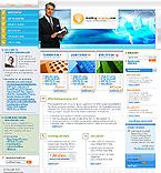
People have gotten wise to Internet amateurism and a poor looking website will turn many visitors off buying. Similarly, a site that lacks focus and tries to be too many things to too many people will not have visitors scrambling to hand over their credit-card details.
现在,设计不专业的网站只会流失潜在访问者。同样,内容量多、缺乏主要内容、希望吸引许多用户的网站也会流失潜在购买用户。
In short, if your website is to succeed, it must inspire visitor confidence, be clear about its purpose and give off a general air of success.
简而言之,成功的网站需要刺激用户购买欲望、明确网站目的、具备成功信心。
Fortunately, you don't need specialist training in web design to create an effective and professional website. Just keep it SIMPLE and keep it FOCUSED and you'll make life easier for both yourself and your visitors.
很幸运,你不需要经过特殊培训,就可以设计出有效、专业的网站。只要遵循简单、内容突出的原则,网站就能方便访问者以及你自己的生活。
Here are 27 things you can do that will give your website a credibility boost:
下面的27条建议可以增强网站信誉度。
1. Aim to capture your visitors' interest as soon as they arrive on your page. It's important that you let them know IMMEDIATELY what they'll find on your site and what they gain by being there. Try to come up with an opening headline that will capture the attention of those people you're trying to reach.
1. 访问者登录网站后,网站需要吸引用户的注意力。访问者需要立即了解自己会发现、找到什么内容,网站可以设计醒目的标题,以吸引用户。
2. Be consistent in your design. Each page should have the same fonts (text style), the same navigation links, the same general layout, the same color scheme, etc.
2. 网站设计要一致。所有网页应该设置相同的字体(文本型号)、导航链接、外观布局、以及配色方案。
3. Choose your colors carefully. Don't put inappropriate colors together. I read an article recently that suggests that designers should look at the colors they're putting together on their web page and ask themselves if they would put wallpaper with that color scheme in their living-room.
3. 慎用网站颜色,避免出现颜色搭配混乱的情况。近来我读过一篇文章,文章介绍说,设计应该询问自己,如果自己卧室的墙纸利用网页的配色方案,是否会感到舒服呢?
4. Use a plain color background (i.e. no fancy textures or designs). Make sure your text contrasts STRONGLY with your background color -- black text on a white background is the best combination.
4. 网页背景朴素、简单,避免眼花缭乱。文本与背景颜色对比要强烈——黑色文本搭配白色背景,是最好选择。
5. Optimize your pages to download quickly. Avoid using excessively large images (both in terms of memory size and actual on-screen size). Images which are too large will slow the download time of your page, often look bad and are usually unnecessary.
5. 优化网页,提高下载速度。避免过多使用大图片(包括存储容量以及实际的显示器尺寸),否则会增加下载时间,并且整体外观效果也会很糟糕。
6. Don't make your pages any longer than they need to be. Pages that scroll down forever can be tiresome and, unless they're well written, keeping your visitor's interest is difficult. Be sure that you NEED everything on the page. It's worth critically examining the contents of a page, sentence by sentence, and ask yourself which stuff is really necessary and which stuff can be done without.
6. 网页不要超过需要的长度。纵向拉动滚动条会让用户感到厌烦,如果内容不是特别有吸引力,访问者不会浏览整个网页。确保网页所有内容都有存在价值,这就需要逐句分析网页内容,并且询问自己,哪些内容是必需的,哪些内容是无存在意义的。
7. Don't be afraid of empty space. Don't clutter up your page with loads of 'stuff'. If it's not essential leave it out. You can draw attention to the important things by giving them space to breath rather than making them big or loud.
7. 预留空白区域,避免出现内容占据整个页面的网页。如果内容都是必需的,你可以在重要内容之间设计空白区域,让用户得到短暂的休息。
8. Be sure to put a link to your home page on every page of your site. Links marked 'Back' are no good to people who've arrived directly onto one of your pages from a search engine.
8. 网站所有网页都要出现与首页的链接。对利用搜索引擎直接进入网站其它网页的用户来说,“后退”链接没有一点好处,需要让他们进入首页。
9. Include your contact information (company name, address, link to contact page and perhaps even tel./fax. numbers) at the bottom of each page of your site. This will save visitors having to search for it, and it will reassure them that you're a real and credible business.
9. 网站需要在所有网页底部设置联系信息,包括:公司名称、公司地址、联系信息网页的链接以及电话与传真号码。这样,用户就不用花费时间寻找这些内容,也增加了网站的可信性。
10. Don't put a graphic counter on your page. People will not buy from a site that has something like "Visitors since 1998: 00001471" in a glaring graphic at the bottom of the page. Just don't do it. You'll have all the statistics you need about your visitors from your webhost (or third-party stats services like sitemeter.com).
10. 网站中避免出现图形计数器,如果网站底部图片中出现:1998年以来的访问者数量:00001471 ,访问者会拒绝购买,所以避免出现此项内容。你可以从虚拟主机中获取此项数据,或者通过sitemeter.com网站获取。
11. Don't clutter your home page with banners, ads, and unnecessary graphics. Less is definitely more in website design. If you want to place ads on you site keep it to a minimum - especially on your home page (maximum 2 banners - preferably none). These only take up valuable download time and distract your visitors from your central product(s).
11. 主页中避免出现横幅标语、广告、无价值的图片。网页设计中,内容简单很重要,如果需要设置广告,确保出现最少的数量,尤其是在主页中(最好没有,最多不能超过2条)。如果此类内容太多,下载时间会增加,用户对重要产品的注意力会转移。
12. Make sure your site works well with the main browsers and screen resolutions. Verify that you've no broken or outdated links.
12. 网站应该在主要浏览器以及屏幕分辨率状态下,呈现精美的外观。避免出现无效、过期链接。
13. Check and double-check your spelling and your grammar. Mistakes on this front will kill a sale quicker than you can say "How do you spell disastor?".
13. 不断检查网站是否出现拼写、语法错误。这些错误比询问“如何拼写disastor”更能打消用户购买信心。
14. Don't even consider putting background music on your site. Nothing sends visitors running away faster than a woeful, repetitive midi file tinkling away in the background.
14. 避免在网站中出现背景音乐。反复出现的哀伤音乐是用户最不喜欢的。
15. Avoid overusing gadgets - again if you don't need it and your visitors have nothing to gain from it, leave it out. There are very few gadgets that impress nowadays. If you want to impress your visitors give them clear information on clearly laid-out pages that download quickly.
15. 避免过度运用新设计元素——同样,如果这些元素的存在没有任何意义,你就应该删除,现在能让用户印象深刻的新元素基本没有,只有清晰的布局、有条理的信息、较快的下载速度,最能吸引访问者。
16. Your navigation bar should contain links to the MAIN pages of your site only. Links to additional sub-pages can be made from those main pages. Try to ensure that nothing on your site is farther than three clicks away from your home page.
16. 导航条中应该出现与主要网页的链接,主要网页中应该出现与其它二级页面的链接。确保用户在三次点击之内,可以从主页进入其它任何网页。
17. If you're using graphics for your main navigation links, you should consider including text links also (at the bottom of the page, for example). This will be appreciated by visitors who can't (or don't want to) download graphics. Also, Search Engine Robots can only follow text links, so if you only have graphic links they will not be able to get to the other pages of your site.
17. 如果导航链接设置成图形,你应该考虑设置文字链接(比如:可以在底部),这样不能或不希望下载图片的访问者可以使用文字链接。同时,搜索机器人可以利用文字链接,否则它们不能进入网站其它页面。
18. Don't put 'under construction' signs on a page. If it's not finished don't make it accessible.
18. 网页中避免出现“网页构建中”的标志。未设计完成的网页不能进行链接。
19. Keep Your Links Honest. Don't put a link that says "Click here for a free gift" that actually sends your visitor to another site that is offering nothing for free.
19. 网页链接必须准确。比如说,“点击此处获取免费礼物”的链接,会让用户进入没有提供免费礼物的网站,这种情况绝对不能出现。
20. Use CAPITAL LETTERS sparingly to highlight important words. DON'T TYPE LARGE BLOCKS OF TEXT ALL IN CAPITALS. IT MAKES YOUR TEXT HARD TO READ AND LOOKS AWFUL. YOUR VISITORS WILL NOT WANT TO READ IT. IF YOU WANT TO HIGHLIGHT SOMETHING IMPORTANT, TRY USING SPACE OR COLOR INSTEAD.
20. 强调重要词语时,避免出现大量大写字母。大段文本不能全部利用大写字母,这样会使内容外观糟糕、难以阅读,会让访问者感到厌烦。你可以运用空白区域或颜色,突出某些重要内容。
21. Don't put large blocks of text in BOLD. You should use bold text sparingly, for emphasis or for headings.
21. 避免出现大段粗体文本。可以利用粗体字,强调重要内容、标题。
22. Don't UNDERLINE any text on your page. People will think it's a link (that isn't working).
22. 网页中避免出现下划线,用户会误认为下划线内容可以进行链接。
23. If you have links incorporated in your text, make sure they're visible. The best way to get your links noticed is to use the standard blue-underlined link look.
23. 文本中的链接应该醒目,突出链接内容的最好方法就是使用标准的蓝色下划线。
24. Avoid the use of frames (i.e. when the screen is broken into two or more parts). These add a whole heap of complications that you can do without.
24. 避免使用框架(屏幕分割成两部分或多部分),这样会造成一些麻烦。
25. Avoid using one of those 'Click here to enter' entry pages. They're a waste of your visitor's time.
25. 避免出现“点击这里进入”的进入页面,这是在浪费访问者的时间。
26. Get others (who have some experience with surfing the Internet) to check out your site. Did they find it easy to understand? Did they find it appealing to the eye? Did they get lost or find themselves stumbling into a dead end? Would they feel confident buying from a site like yours? Leave a message at webmaster forums asking fellow website designers to give a look at your site and make comments.
26. 让一些有经验的人检验网站。网站是否利于他们理解? 网站视觉效果是否良好? 他们是否会迷失或者进入链接的网页?他们是否放心在网站中购买产品?在网站论坛中留言,寻求网站设计者的帮助,让他们对网站进行评价。
27. Concentrate on keeping things as simple as possible -- both for you AND for your visitors.
27. 网站内容、设计尽量简单——方便自己与访问者。
 评论 (0) All
