当前位置: 首页 > 网络学院 > 设计教程 > 设计理念 > 设计合理的网站主页确实能吸引访问者
Where would we be today without vacuums? Think about it: The vacuum is a brilliant invention. It sucks up your household dirt and puts it exactly where you want it to go - off your floor and into that little bag.
如果没有吸尘器,生活会怎么样?吸尘器确实是一种伟大的发明,它可以把房间地板上的所有灰尘,吸到那个小的垃圾袋中。
A successful homepage acts exactly like a "digital vacuum" - it sucks users in, away from the homepage, and straight to important content within the rest of the site.
成功的主页应该类似于“电子吸尘器”——吸引用户,然后指引用户浏览网站的重要内容。
Your site visitors are faced with only two choices once they're on your homepage: Either they click past the homepage to your site's secondary pages, or they click the back button and leave your site.
网站访问者进入网站主页,面临两个选择:进入网站二级页面;或者点击后退键离开网站。
You'd obviously prefer they click past the homepage. But how do you get them to do that?
你肯定希望网站访问者进入二级页面,但如何达到这个目的呢?
Pull, Don't Push
根据用户需要,提供相关信息
What's the best way to get users to click deeper into your site? By pulling, rather than pushing.
吸引用户浏览二级页面的最好方法是什么?不能推动,而是牵引用户浏览网站。
You've probably heard the terms "pull technology" and "push technology." Our friends at LearnTheNet.com tell us pull technology refers to technology that allows users to pro-actively seek out information, whereas push technology refers to technology that delivers information to users, usually at regular intervals and without the user actively seeking the information.
你可能听说过两个术语:推技术(push technology)与拉技术(pull technology)。LearnTheNet.com的一个朋友告诉我,拉技术允许客户提前挑选信息,然后根据用户需要发送信息;而推技术不管用户是否需要,每隔一段时间都会向用户发送信息。
I use these terms loosely to refer to the way in which a homepage can deliver content to a user. I've seen too many homepages that try to push users to other pages on the site by "feeding" them only a few simple links or very brief content.
运用这两个术语,只是要说明主页为用户提供信息的方法。我看到很多网站主页,仅仅提供内容摘要以及简单链接,希望推动用户进入其它页面。
I've also seen a lot of great homepages that successfully pull instead of push. Some of the better ones include the following:
然而,很多成功主页会牵引用户浏览其它二级网页,而没有使用推动的方法。下面几个网站就是这样:
- 1-800-Flowers.com
- Handspring.com
- Fool.com
- EddieBauer.com
- Amazon.com
- REI.com
The developers of these homepages understand how to pull users into important areas within their sites by enabling them to choose from a variety of both links and content. These developers understand that not all users even know what they're looking for and need a variety of ways to gather information. And they understand that not all users are alike.
这些网站主页设计者了解,如何吸引用户通过选择链接与内容,进入其它页面。这些设计者明白并非所有用户都了解自己需要什么内容,他们需要多种收集信息的方法。设计者还明白,用户与用户之间存在差别。
Two Kinds of Users
用户的两种类型
You may argue that the sites I just mentioned have visually "busy" homepages. You're probably wondering, "Doesn't that confuse the user?"
你可能认为上述网站主页内容很多,用户会不会迷惑呢?
Good question. Good answer: not necessarily.
问题很好,答案是:不会。
And here's why: In his book "The Web Content Style Guide," Gerry McGovern reports a study by the prestigious
原因:在Gerry McGovern的"The Web Content Style Guide"(书名)中,作者提到Palo Alto研究中心(以前的Xerox PARC)的一项调查,调查发现,75%的网站信息浏览者盲目收集信息,只有25% 的信息浏览者会目的明确地寻找信息。
Granted, we can't directly apply those findings to all Web users, since the study referred only to Web "readers." But a loose application of the study's findings shows why the Web sites mentioned earlier have so much content on their homepages. Yes, some users may be searching for specific products or information. But a larger majority may just be browsing for content.
当然,并不是所有网站用户都这样,毕竟上述研究只是针对网站信息浏览者。但通过研究结论,我们不难理解上述网站主页出现很多内容的原因。是的,许多用户可能寻找具体产品或信息,但更多用户只是浏览内容。
These findings are harmonious with Jakob Nielsen's argument that there are two kinds of users: those who search and those who browse.
这项研究结果与Jakob Nielsen的论点不谋而和:网站用户分两类,搜索用户与浏览用户。
A homepage that has only four links is definitely easy to navigate for those who search but does nothing for those who browse in content-gathering mode. Not only that, but users are forced to choose from pre-categorized links such as Products, Company Info, etc., when they may not even know what they're looking for.
对搜索用户来说,网站主页设置四个链接就可以,但对于浏览用户,四个链接远远不够。而且当浏览用户不了解所需内容时,他们需要从已分类的链接中进行选择,例如,产品,公司信息等等。
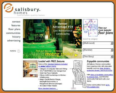
For example, take a look at the homepage for RentStinks.com, the Website for a local homebuilder here in Utah:
你可以浏览RentStinks.com的主页,这个网站是为犹他州一位房地产开发商设计的。

Really easy to navigate, right? Just pick a link and go.
很容易操作,对不对?点击链接,就能进入其它页面。
However, put yourself in the place of someone visiting the site: Suppose you're a first-time homebuyer (which happens to be the site's target audience). You're probably in content-gathering mode. Perhaps you're looking for a three-bedroom, two-story home.
假设你自己是网站访问者:你是第一次登录网站的浏览用户(网站目标用户),寻找三个卧室,上下两层的房子。
But is that all you're looking for? What about the location of the home? The amenities? Do you even know what a "rambler" is? (Confession: I didn't when we began searching for our first home.) Or perhaps you're not sure what to look for in a home, or even why you should choose one homebuilder over another.
你仅仅会关注这些内容吗?是不是还要考虑房子的位置、设施呢?首先搜索哪些内容呢(我承认,我也知道首先搜索什么内容)?或者,你并不了解需要搜索什么内容,甚至不知道选择那个房地产开发商?
Therefore, when you put yourself in the shoes of the user, the homepage for RentStinks.com then becomes less and less helpful. It attempts to push you to Floor Plans, Communities, and so on, rather than pull you to the page that contains 20 convincing testimonials from satisfied customers or to the page that talks about Category 5 network wiring being a standard feature on all homes. What's worse is it does all of this without showing hardly any pictures of its homes.
因此,RentStinks.com主页对用户的帮助作用很小。它试图推动用户了解建筑平面图、公司情况,而没有引导用户进入包含客户满意推荐书的网页,以及介绍Category 5 网络布线(住宅标准特征)的网页。更糟糕的是,主页没有出现任何介绍房子的图片。
Creating a Homepage that "Sucks"
创建吸引用户的主页
It's easier than you think to create a homepage that draws users in. Take these three ideas for a test drive on your own site:
创建吸引用户的主页要比想象中的简单,参照以下三条建议,进行设计。
Bottom-Up Development
颠倒式开发
Perhaps the hardest obstacle to overcome is changing the way you mentally and physically approach the development of a homepage. Most developers start at the top and work their way down, creating all of the content and design for the homepage first and then trying to push users to other pages on the site.
开发过程中,可能最难克服的就是从心理上改变固有的主页设计方法。许多网站开发者遵循自上而下式的设计方法,即首先确立网站主页的内容与布局,然后试图推动网站用户浏览其它网页。
To create a homepage that pulls, you need to develop from the bottom up, creating content for the secondary pages first. Then determine which of these pages should be emphasized and where to place appropriate links, images, and content on your site's homepage.
遵循自下而上式的设计方法,才能创建出能够牵引用户浏览其它二级页面的主页,即首先确立二级页面内容,然后确定重点页面,设置相关链接,建立网站主页。
Stephen Covey's maxim "begin with the end in mind" is well suited for bottom-up Web site development. Determine the final pages on which your visitors should land, and emphasize those pages on your homepage.
Stephen Covey的座右铭就是:从最后开始,这句话尤其适用于自下而上式的网站开发,即首先确定访问者最后登录的页面,然后在主页中重点强调这个页面。
Link Wording
连接字
What? You've already created your homepage? No problem. An easy fix: Try adding links or even rewording existing ones.
如果网站主页已经确立,可以进行简单修改:增加链接或者重新确立现有链接。
A couple examples:
两个例子:
- Instead of About Us, try
Find out why we've been in business for nearly 50 years
“企业经营50年”,取代“关于我们”的链接。
- Instead of Products, try
Let us show you how Product X can improve your health tremendously!
“显著改善健康的产品”,取代“产品”链接。
I'm not suggesting you rid your site of the About Us or Products links. I'm simply suggesting you add other links that may point to the same page or category of pages, but that are more successful at pulling users rather than pushing them.
我并不是建议你删除“关于我们”以及“产品”链接,只是建议你增加与同一网页或者同类网页的链接,但是牵引用户购买会更成功。
Don't Just Say It, Show It!
避免只出现文字说明,可以使用图片。
As obvious as it may seem, don't just bore your site visitors with endless lines of text. Give them plenty of visual flavors to enjoy. If you sell homes, show floor plans and amenities on your homepage. If you offer Web development services, show some of your work on your homepage. You can rest assured a picture will often be understood more quickly than a sentence will.
用户不喜欢出现许多文字的网站,所以网站可以设置图片,为用户提供视觉享受。如果销售住宅,可以在首页中出现建筑平面图或者房间设施图片。如果提供网站开发服务,可以在首页中展现你所设计的作品。一张图片通常比一句话更容易理解。
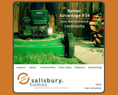
What if RentStinks.com applied these three principles and restructured its homepage? It could end up something like this:
如果RentStinks.com运用以上三条规则重新设计主页,可能会是下面这样:

Finally, Don't Forget Targeted Content
明确目标内容
Is emphasizing a few important secondary pages and rewording a few links enough to create a homepage that "sucks"? What if your site visitors find the homepage content to be completely useless?
通过突出二级页面以及重设链接,就能确保主页能吸引用户吗?如果主页内容对用户没有任何价值呢?
BlueLight.com, Kmart's former Web site, faced this beastly problem. A study conducted by the site's research team revealed a startling fact: Nearly 50 percent of the site visitors left before ever clicking past the homepage! Despite the fact that BlueLight's homepage had sufficient links and content, the available information was apparently of no use to half of the visitors.
Kmart以前的网站BlueLight.com就存在这样的问题。这个网站的研究人员发现了一个令人吃惊的事实:将近50% 的网站访问者在没有进入二级页面之前,就会离开网站。尽管BlueLight.com主页中,链接多,内容丰富,但提供的信息对一半访问者来说,没有任何意义。
How did BlueLight.com correct the problem? They created eight targeted homepages, each of which was displayed based on the visitor's preferences. When visitors returned to the site, they not only saw a variety of content but targeted content, as well.
BlueLight.com如何解决这个问题呢?他们按照访问者喜好,设计了8张目标主页。用户返回网站时,不仅能浏览大量其它内容,还有目标内容。
Take a look at your site's statistics and you may see the same thing BlueLight.com saw. If you don't remember anything else in this article, remember this: Never assume your visitors will click past the homepage. They've arrived at your site somehow and for some reason. Now give them several compelling choices to encourage them to click further into the site before they have a chance to click the back button.
你的网站可能也会出现BlueLight.com这种问题。阅读完这篇文章,有一点必须牢记:避免访问者未点击主页前离开网站。既然用户已登录网站,你就需要提供具有吸引力的选项,激励用户进入其它页面,而不能让访问者离开网站。
Does this article cover everything you need to know to create a homepage that pulls? Of course not. But it's a start. Try a few of these suggestions and you'll be well on your way to creating a great homepage that really "sucks."
创建吸引用户的主页,仅仅需要了解这些内容吗?当然不是,但这是创建主页之初,所必须遵循的。在这几条建议的指导下,你肯定能创建出能够吸引用户的主页。
 设计理念 中的 设计合理的网站主页确实能吸引访问者


 评论 (1)