当前位置: 首页 > 网络学院 > 设计教程 > 设计理念 > 网站图片设计原理
 设计理念 中的 网站图片设计原理
出处:互联网 整理: 软晨网(RuanChen.com) 发布: 2009-03-01 浏览: 2024 ::

收藏到网摘: n/a


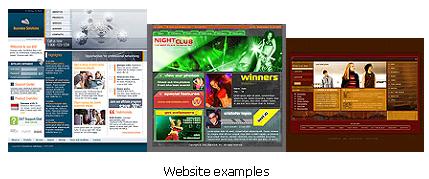
We've all seen them. Poorly designed web sites that make you cringe as soon as they load. But how do you keep your website from becoming, well, ugh. You could hire a professional web designer, and that's expensive, or maybe you already hired a professional, or someone who claims to be professional, and you don't like what they're doing with your site. It all comes down to the K.I.S.S. principle; keep it simple stupid. And you're probably asking well what does this really mean for web design.
登录设计质量差的网站,会产生厌烦的感觉,我们可能会有这样的体会。如何设计出高水平的网站呢?你可以聘请专业的网站设计者,但需要支付很高的设计费用;或者你聘请过专业的、或者自称专业的设计者,但并不喜欢他们的设计。网站设计原则可以归结为K.I.S.S:设计一定要简单。你可能会问:按照这个原则,如何设计网站呢?
Here are some basic graphic design/web design principles that you can use on your site:
设计网站时,可以利用以下几个网站或图片设计原理:
1. Background, be careful what color you use for the background of your site. Yes I know that you're trying to get noticed, but really they've already decided to look at your page so why does it have to be orange? Seriously though, consider how long you want people to be on your site, half an hour, one hour, more? Whatever the time chose your background color and then sit in front of your computer and stare at it, for awhile. Is the color easy to look at? Difficult? Does it make your eyes water? Does it make you calm? If you can look at the color for about fifteen minutes without a problem you're okay.
1.背景,谨慎选择网站背景颜色。是的,我知道,你希望背景颜色能够吸引用户的眼球,但既然他们决定浏览你的网页了,为什么把背景设计成橘黄色呢?认真考虑这个问题:你希望用户在网站上停留多长时间呢?半个小时,一个小时,还是更长的时间。根据这个时间,选择背景色,然后坐在屏幕前观察一段时间。颜色容易被你接受呢?还是难以接受呢?会不会让眼睛不舒服?能让人平静吗?观察15分钟以后,没有问题,可以选择这个颜色。
2. Text, related to the above be careful what text color you use. Follow the rules above for determining a text color. It should be easy to read, and look at.
2.文本,文本颜色也很重要。根据上述原则,选择文本颜色。文本必须易读、易浏览。
3. Font, no more that three fonts on the entire website. I mean that! A big mistake that I see a lot of times is the use of more than three different fonts, it get's hard to read no matter how neat you think it looks.
3.字体,整个网站不要超过三种字体。有些网站经常会犯的一个大错误是:出现的字体超过三种。在这种情况下,不管你认为内容安排多么整齐,都不利于浏览者阅读。
4. Font size, no more that three font sizes either. Now I don't mean three font sizes for each of the three fonts you've chosen. I mean no more than three fonts with a total of three sizes throughout the entire site, and if you can get by with less even better. It will simplify your site.
4.字号,不要超过三种字号。我的意思不是说,三种字体中,每一种字体的字号可以有三种,而是说,三种字体总共的字号不要超过三种。如果网站字号少于三种,这样更好,可以使网站更加简单。
5. Scrolling, this is a big one literally. I've been on too many sites where I had to scroll down so far that my computer beeped at me. This is really important on your main page. Keep it very sparse, generally any information that someone has to scroll more than one full page down for will not be read.
5.滚动条,这确实是个大问题。我曾经登录过很多网站,必须要拉动滚动条才能找到想要的内容。你在设计网站时要特别注意这一点,尽量不要使用滚动条,因为浏览者不会在整个页面中阅读到所有的信息。
This is only a start of course but it's a start and it is on these issues that I see so many problems. Always remember that simplicity is best.
当然,这仅仅是开始,但是设计开始已经出现这么多问题。请永远记住:简单最重要。
 评论 (0) All
