当前位置: 首页 > 网络学院 > 设计教程 > 设计理念 > 网站设计的基本技巧
 设计理念 中的 网站设计的基本技巧


Let's pretend. Let's pretend you asked me to design a Web site for you. Then we also need to pretend, of course, that I said yes, which I would almost never do because freelance clients are usually nuttier than an Almond Joy and about as smart as a bag of hair. I'm speaking generally, of course.
让我们来假设一下,假设你让我为你设计网站。继续假设,我说可以,然而我可能会达不到你的要求,因为自由职业者的客户经常会比一般客户要求更高,当然,并不是全部客户都这样。
Now pretend I said, "I quit. You can design this site by yourself." Which I'd most likely do, because in this scenario you're the client, and I've already expressed my views about the client.
现在假设我说:我放弃,你可以自己设计网站。其实我更想这样做,因为在这种情况下,你是客户,我只是向客户表达我观点。
"Don't worry, though. I'll talk you through it," I say. "Why? Because that's the kind of guy I am."
“不过不要担心,我会告诉你设计的方法”我对客户说。“为什么?因为我就是这样的人。”
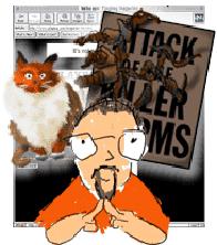
The first thing you need to do is ask yourself a few questions. What is the point of the site? What are your goals? Do you want to show the world pictures of your cat? Are you trying to sell worms through the mail? Are you promoting your new major motion picture? The answer will help you begin to focus your page. As you edit your material, you will quickly see that the picture of your cat has no business on the homepage of your new blockbuster.
首先,你需要问自己几个问题。网站的主要内容是什么?网站的目标是什么?你想把贵族猫的图片展现给浏览者吗?你是想通过邮件销售蠕虫程序吗?你是想宣传你的移动图片吗?这些问题的答案可以帮助你进行网页的设计,在编辑内容的时候,你很快就会发现:猫的图片与新网站的内容没有一点关系。
Next question: Who are you, and who's your audience? Are you a 12-year-old girl trying to communicate with other 12-year-old girls? The president of a start-up company trying to get some cash from an investment bank?
下一个问题:你的身份是什么,你的受众是哪些人?你是不是一个十二岁的女孩,是不是想跟同龄的女孩进行交流呢?你是不是一个刚成立的公司的老板,是不是想从投资银行贷款呢?
Then you've got to answer technology questions. You might have to guess on this one, but you still need to think about it. How will your audience view your page? Will your content appeal to a business crowd accessing the Net on a T1, or is it for the folks at home with 14.4 modems? While considering speed, you should also think about browsers and plug-ins as well. What makes more sense for the purpose of your page? You don't need Shockwave, RealAudio, or Java if you only want to post a picture of your cat. On the other hand, they might be necessary if you want to impress people with fancy-shmancy smoke and mirrors. Remember,
然后,你需要解决一些技术问题。你可以假设一个解决方案,但必须要认真思考。你的受众会怎样浏览网页呢?网站的内容是吸引那些利用T1上网的商务人士呢,还是吸引利用调制解调器上网的家庭用户呢?考虑传输速度,也要考虑浏览器和插件。哪些插件对实现网站目标更有意义呢?如果你只是想展示猫的图片,那你就不用考虑Shockwave、Audio、或者是Java。但是,如果想在网站上设计奇特的画面,给用户留下一个深刻的印象,那你可以利用这些插件。请记住: 24美元和一些珠宝就可以把曼哈顿买下。
.jpg)
.jpg)
Now that you've figured out what your site is about, who the viewers are, and what kind of technologies you want to use, it's time to think about hierarchies. Not everyone has a huge monitor, so your most important elements need to be at the top of the page, where viewers will see it immediately. The smallest monitor out there is 640 by 480 pixels, so your design should work on a basic level within those parameters. If one of your goals is to get people to call your 800 number, you better make sure they can see it without scrolling. (Advertisers don't want their banners placed three clicks down for a reason.) Think of that first screen as the front page of a newspaper. Really important stuff goes on the front page, and the most important stuff goes on the top or "above the fold," as newspaper folks say.
在确定了网站内容、网站受众以及网站需要利用的技术之后,你就需要考虑网站的层次了。不是每一位用户都有大的显示器,所以网站的重要部分要放在网页的顶部,这样浏览者登录网站后会立刻看到这些重要内容。最小的显示器像素是640x480,所以设计时,保证网站在这些参数范围内可以正常运行。如果网站的一个目标是:希望浏览者拨打网站的免费电话,那最好保证浏览者在不需要翻动网页的情况下就可以看到相关的内容(广告客户不希望用户点击三次才能看到广告内容 ),你可以效仿报纸的头版来设计网站的首页。报纸中重要的内容要放在头版,最重要的内容要放在头版的最顶部。
Another thing to remember is that people read left to right and top to bottom. They almost always look at the upper-left corner first, which is a good place to put something really important. None of this holds true, of course, if you're Japanese and read top to bottom, right to left, but the point is that it's good to be aware of how your audience's eyes will travel across the page.
用户的阅读习惯是:从左到右,从上到下,这一点你必须要记住。他们总是先注意到左上方的内容,所以,那里应该放置最重要的信息。当然,这个布局方式并不是在任何情况下都适用,比如说,日本人的阅读习惯是从上到下、从右到左,这时你就要改变布局,但只要记住一点就可以:了解用户的阅读方式,进行内容的布局。
When deciding which colors (your palette) you'll use on the site, you need to ask (again with the questions):
在决定使用什么颜色时,你还需要询问这些问题:
- Do the colors you pick work well with the goals of your site?
选择的颜色能促进网站目标的实现吗? - Do the colors exist on the 216 universal-color palette?
颜色是否都存在于216种颜色的调色板上? - In an old browser, will you be able to read black type on the background color you picked?
在陈旧的浏览器中,你是否能在背景颜色下,清楚地浏览内容呢?
Colors are to Web pages what fonts were to desktop publishing in the '80s. People think that just because they have 216 colors, they should use them all. Use a limited palette: A few colors can go a really long way. Be smart about the colors you pick. Don't think in terms of your favorite or least favorite colors. Just make sure they support your message and tell your story.
颜色对于网站的重要性就像是80年代字体对于印刷媒体的重要性一样。人们认为,既然有216种颜色,网站就应该全部利用这216种颜色。不要这样,限制颜色的数量:几种颜色也可以发挥很大的作用。选颜色的时候,必须要谨慎,不要根据自己的喜好而进行选择,要根据内容的需要来进行选择。
The other big question with color is readability. The type should sit comfortably on the background color. It's more than an issue of high contrast. White type on a black background is readable, but if you try light grey type on black, the end result is more comfortable to the eye. If you go for a lot of contrast and then back off a bit, you'll probably end up with something subtle that's a little more complex and interesting. Of course, you can never go wrong with black type on a white background. It might not be the flashiest way to go, but it's bulletproof.
使用颜色需要考虑的另外一个问题就是可读性。我们不仅要考虑内容与背景颜色的对比效果,还要考虑它们的融合效果,黑色背景下的白色字体更易于阅读,但如果在黑色背景下设置浅灰色的字体,可能结果会更好。稍微调整网站中对比强烈的颜色,网页的颜色可能会很微妙:既复杂又有趣。当然,白色背景下运用黑色字体,永远不会错。这可能不是一种最浮华的方法,但永远是一种正确的方法。
Readability part two: The bigger the type, the easier it is to read; the longer the line length, the more difficult it is to read. As a basic rule of thumb, use the <blockquote> tag or a table to shorten your line length. I'd also think twice about setting body copy in anything smaller than <font size=+1>. After all, you want people to read your writing. Also avoid making entire sentences links. It's cleaner and simpler to link off one word or a short phrase.
可读性方法之二:字体越大,越容易阅读;一行内容越长,越难阅读。你可以使用<blockquote>标签或者是表格来缩短长度。在小于<font size=1>的情况下,我会考虑设置,毕竟,你希望浏览者阅读你的内容。同时要避免使用长句,把他们分解成短句和短语更有效。
.jpg)
.jpg)
Why I love blockquotes, part two: White space is your friend. White space doesn't necessarily need to be white - it can be any color you want, but it should be blank. Eye relief is the concept here. Don't be afraid to leave some space around a GIF. Fat margins around body copy work nicely as well. White space helps the reader's eyes rest on what's important - whether that's an image or words. It helps unclutter your design and focus your concept.
我适用空白区域的原因是:它可以提高网页的观赏性。空白区域不一定是白色的,你可以填充你喜欢的颜色,但必须保证它是空白的。这样可以使浏览者的眼睛得到片刻的休息。你也可以利用GIF设计空白部分,这样的效果也很好。空白部分的出现可以保证浏览者的眼睛停留在重要的信息上(不管是图片还是文字),可以保证页面的整洁,还可以突出你的设计思想。
I'll close with another idea that isn't new or mine. My former boss once said to me, "Keep it simple, stupid." (Hopefully, this wasn't directed at me.) Focus your ideas. Make sure everything on your page has a really good reason for being there. Make sure you spend as much time picking out your images and colors as you spend on your copy. Make sure the level of technology you decide to use works with the overall goals of your page. Keep it simple. Keep it smart.
有一个观点既不新颖也不是我总结出来的,但我接受这个观点。我以前的老板曾经跟我说:“做事情要简单,傻瓜。”在网站设计中,突出设计者的思想,确保网页的每一样内容都有它的存在价值。要保证:认真挑选网站的图片和颜色,还要保证设计技术促进网站目标的实现。网页设计要做到:简单、巧妙。
 评论 (0) All
