当前位置: 首页 > 网络学院 > 设计教程 > 设计理念 > 创建吸引用户的确认网页
Including a form on your website is the best way to get feedback from your visitors.
表格可以帮助网站获取反馈信息
You can have a form to gather your visitors' email address so that they can subscribe to your ezine. Or you can have a form to collect visitors' comments about your site. Also, forms allow your visitors to send you a request for a quote, or to send you all the necessary information when they want to buy your products or services.
为了方便浏览者订阅电子杂志,你可以创建表格收集他们的电子邮箱地址。或者可以创建表格收集访问者对网站的评论。在访问者希望购买产品或者享受服务的时候,他们可以通过表格发送请求或者某些必需信息。
In all these cases, you must design a confirmation page that will pop up after your visitors successfully fill up and submit a form. Unless you design a confirmation page, your visitors will be thrown into the generic confirmation page provided by your web host (usually an unsightly white screen displaying a convoluted plain text message written in a dated font type, that will most likely confuse your users and make them think that they have been thrown out of your site).
在任何情况下,访问者填写、递交表格以后,网站都要出现一张确认网页。如果没有设置确认网页,虚拟主机会提供一张普通的确认页(难看的白色屏幕中呈现出利用陈旧字体编写的令人费解的纯文本信息)。这时,用户会产生疑惑,认为自己离开了你的网站。
The confirmation page has several objectives:
确认网页的目标
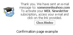
 It must clearly tell your users that the form was completed and sent successfully. For example, if the form is a subscription box for your newsletter or ezine, your confirmation page will say something like this: "Congratulations! You are now subscribed to our newsletter."
必须明确地告诉用户表格填写完成、发送成功。比如说,如果表格是定制网站时事通讯或电子杂志的,确认网页应该这样:“祝贺您!成功定制时事通讯服务”。
It must give clear instructions of what your visitor has to do next. To use the same subscription box example, your confirmation page will also say something like this: "You will soon receive an email message asking you to follow a link to activate your subscription. Follow that link to start receiving your ezine immediately".
清楚地告诉浏览者下一步做什么。还是拿定制时事通讯为例,确认网页也应该出现这样的内容:您会马上收到一封电子邮件,帮您进行链接,开通资讯定制服务。链接以后,你可以马上接收到电子杂志。
It must provide your visitor with two or three navigation options so that he can continue browsing your site (don't just let him go…). Two popular options are: "Return to our main page" and "Browse our archives" (although depending on the size and the architecture of your site you can offer other options as well). One important consideration is that your confirmation page must have the same look and feel as the rest of your pages, so that your visitor will know that he is still in your site.
网站必须为浏览者提供2-3种导航选择,这样才能保证浏览者继续浏览网站。这两种选择通常是:返回主页、浏览文件,当然你可以根据网站内容大小与结构提供其它选择。你需要重点考虑的一个因素是:确认网页要与其它网页外观一致,这样用户才不会有离开网站的感觉。
Once you create your confirmation page, you must insert the necessary HTML code to your form script, so that the browser will automatically display your confirmation page once the form has been successfully submitted. You do this by adding the following code after the <input type="hidden" name="success" value="http://www.yoursite.com/confirmationpage.html"> tag at the beginning of your form script.
一旦创建出确认网页,你必须要在表格原编码中插入必要的HTML编码,这样表格成功提交以后,浏览器才会自动地呈现确认网页。你需要在表格代码开始加入<input type="hidden" name="success" value="http://www.yoursite.com/confirmationpage.html">标签,才能达到目的。
 设计理念 中的 创建吸引用户的确认网页


 评论 (0)