当前位置: 首页 > 网络学院 > 设计教程 > 设计理念 > 网站设计基本原理
 设计理念 中的 网站设计基本原理
出处:互联网 整理: 软晨网(RuanChen.com) 发布: 2009-03-01 浏览: 2213 ::

收藏到网摘: n/a


Home page should clearly indicate what the site is about. Provide top level navigation on the first page, your logo, and tell to the visitor what he can found on your web site.
网站首页应该能够清楚地展示网站的性质和内容,应该能够提供高水平的导航系统、logo,应该能够让访问者了解网站所提供的产品或服务。
Your home page should be informative, and should call your visitor on action. Home page is the place where the visitor decides what he will do, click on some of your links, or leave the site. If you have a discount, or if you offer some free service in attempt to make a contact with potential customers, make sure to provide link to that service on your home page.
网站首页应该提供有效信息,并且能够刺激消费者做出行动。网站首页会决定访问者的行动:进行链接或者离开网站。如果网站为了吸引潜在客户,进行打折或者提供免费服务的活动,网站首页要能与这些内容进行链接。
If you decide to implement flash intro on your first page, make sure to give the user possibility to skip the flash intro. The link "skip intro" should be outside of the flash, because you will force the visitor to wait until the Flash movie is loaded.
如果首页是flash引导页,你要确保用户可以跳过这些flash引导内容,“skip into”的链接应该设计在Flash的旁边,这样才不会迫使用户浪费时间等待Flash电影的下载。
Navigation structure
导航结构
Place the navigation on the place where the people are used to look for it. Don't experiment with the navigation! I can't stress enough this. Keep the navigation system same on ALL pages. Visitors are not ready to learn your site navigation system. Consistency is the most important thing here. You should focus your effort on building consistent rhythm across all pages of your site.
导航菜单设计在用户习惯寻找的地方。我需要特别强调一点:不要对导航系统进行试验,所有网页的导航系统要一致。访问者没有时间去了解网站的导航系统,导航系统的一致性很重要,你应该致力于构建所有网页导航菜单一致的网站。
Font size
字体
Your font size should be enough big so your text can be read without effort. There are many people who will not bother to read very small letters. Don't loose your visitors because of font size. Optimal size seems to be 12-13 points. Visitors should be able to read your text easy, without any effort. Broke big chunks of texts in paragraphs and make them easy to follow.
页面字体要足够大,确保浏览者不用费力浏览文章,有些访问者在阅读小字体的文章时会感到厌烦。不要因为字体,流失网站的浏览者。最佳状态是:每行保持12-13个字,这样浏览者才可以毫不费力地阅读文字内容。把大段的文字分成几小段,也能方便阅读。
Line Length
行长
The length of a line of type should be comfortable to read. The optimal line length for printed materials seems to be about 10 to 12 words, or 60 to 70 characters. Somewhat shorter lines of about 40 to 50 characters may be more appropriate for larger displays. If the line is too long the reader must search for the beginning of it; if it is too short it will break up words or phrases awkwardly.
行长要适于用户阅读,打印材料的最佳长度为10-12个单词,60-70个字符。40-50个字符的长度更适合大篇幅文章的展示。如果段落很长,读者需要花时间找到文章的开始;如果段落过短,会把句子和短语分解。
Creating emphasis
创建强调符号
Creating emphasis is an important and integral part of designing and typesetting. Handled with taste and good judgment it can help direct and inform the reader. When these qualities are lacking, or someone feels that every word is important and must be emphasized in some way then your web page starts to look like a battlefield and becomes difficult to read!
在设计和排版的时候,创建强调符号是一项重要并且主要的工作。在品位以及正确的判断力引导下,这种方法可以指导用户阅读。当没有出现这些内容时,有些读者就会感觉每个词都很重要,必须要找到重点,这时你的网页就像战场,非常不利于用户的阅读。
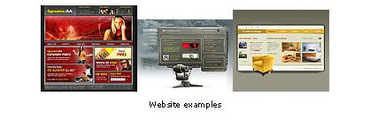
Graphics
图片
It's well known that one picture worth more than million words. This rule applies on Internet too. Do your best to show clear, attractive photo of your product. If you offer a service, find a photo which will best describe him. However, be careful about file size. Don't compress your photo to that level to not be clear, but also don't leave the photo on full quality. That will make file size too big, and will increase download time.
我们都知道,一张图片可以表达百万多句话的内容,在因特网上也是这样。如果介绍产品,把清晰、有吸引力的产品图片展示出来;如果提供服务,把最能体现这种服务的照片呈现出来。然而,要注意文件的尺寸,不要把图片压缩到画面不清楚地状态,也不要保持图片的原有状态,这样内容很大,下载速度很慢。
Gif vs. JPEG
Gif格式 vs. JEPG格式
Less experienced web designers many times use wrong format to store their picture. Here are few guidelines which will help mistakes to be avoided. If your photo has small number of colors (less then 64) GIF will be better choice. Make sure however to reduce the palette size too. That is, if your image have10-15 colors only, reduce your palette on 16 or 32 colors.
Also, if your image contains text, GIF format should be your choice. JPEG use loosy compression method and will cause text and edges to become blurry.
经验少的网络设计者经常运用错误的格式储存图片,下面介绍几条建议,可以避免出现这种错误。如果图片的颜色少(少于64种),你可以选用GIF格式,这时你要减少色区,也就是说,如果图片有10-15种颜色,色区可以减小到16或是32种颜色。如果你的图片包含文字,你最好选择GIF格式。JEPG利用非精确的压缩方式,会使文字和图片边缘变得模糊不清。
If you are saving a photograph - save it as JPEG
利用JEPG格式保存照片
JPEG images can contain over 32 million different colours. That is much more than the human eye can see.
JEPG图片能包含3200万不同的颜色,远远大于人类眼睛看到的颜色。
If you want to incorporate large text into a photographic image, JPEG may be a good format to use. While the edges may still get blurred, danger of it becoming unreadable is slim. If you think your image is more important than the text, go ahead and use the JPEG format.
如果你想把内容大的文章与照片结合在一起,你最好选择JEPG格式。尽管边缘还是会有点模糊,但这个缺点已经变得无足轻重。
Speed
速度
Do your best to reduce the download time. We live in a busy world and people are not will to wait long time. Try to reduce size of your graphics as much as possible without to destroy the image. Image must look good, but size (in KB) should be as small as possible.
尽可能减少下载时间。我们生活在一个匆忙的时代,人们不会浪费太多的时间去等待。尽量在保证图片质量的情况下,缩小图片的尺寸。图片质量要好,尺寸要尽量小。
Test before publishing
运行前测试网站
Do your homework, and do it well. Your visitors will not bother to send you an E-Mail that some of your links does not work or that some of your images does not appear. Even if someone do so, it is quite embarrassing. Perform spell and grammar checking. Remember that in many cases visitor will build his opinion about you or your company on base on your web site. When published, site should not contain any "under construction" or "coming soon" messages.
做好前期的准备工作。访问者不会因为链接或者是图片未出现的问题,就给你发电子邮件。即使有人这样做了,也只会让你尴尬。检查拼写和语法错误,也是一个重要方面。请记住:很多情况下,访问者通过网站确立对公司的印象。网站运行以后,不能出现 “未建设完毕”或 “就要建设完成”这一类的信息。”
 评论 (0) All
