当前位置: 首页 > 网络学院 > 设计教程 > 设计理念 > 飞行菜单损坏导航系统
 设计理念 中的 飞行菜单损坏导航系统
出处:互联网 整理: 软晨网(RuanChen.com) 发布: 2009-03-01 浏览: 1999 ::

收藏到网摘: n/a


Hidden menus are like hidden road signs: they force you to stop when you'd rather keep going. We examine the weaknesses of pop-up, pull-down and cascading menus.
隐藏的菜单就像隐藏的路标:当你想继续行走的时候,迫使你停下。我们分析一下弹出菜单、下拉菜单和层叠式菜单的缺点。
As a kid riding in the back of the family VW, I used to sit and watch my father pull into roadside information bays in small towns, looking for directions to some feature of local interest. You still come across those information bays, but almost no-one uses them these days.
在童年的时候,我经常坐在汽车的后座上,看着父亲走到路边的信息牌旁边,寻找到达当地旅游地点的正确方向。现在你也许见过路边的信息牌,但现在基本上没人用了。
And why have they fallen into disuse? Because the highway navigation system has improved. Road signs have grown bigger and clearer over the years, making the information in the information bays unnecessary. These days the casual tourist looking for the exact location of the Big Lobster or the
为什么这些信息没有人看了呢?原因是高速公路的导航系统改善了。近几年以来,高速公路的路标越来越大,越来越明显,使信息牌逐渐失去功能。外地游客在高速公路上,寻找Big Lobster或者是State Goat的地点时,路标会提前几公里就给你提示。
Web sites are going through this same evolution - from hidden, stop-and-check navigation to a drive-through model. And about time, too. Breaks in car journeys refresh drivers (and often relieve child-sized bladders, or so I recall). Forced delays in finding Web information, on the other hand, merely give users another reason to click away to some other site. Right now, too many Web travellers have to pull over to the side of the road to find the destination they want. And the Web equivalent of the roadside information bay is the fly-out menu. In all its forms, it is used too often.
网站也要经历这样的改革——隐蔽、限制的导航系统将会被明显、功能好的导航系统所取代。在旅行中,偶尔停车休息会让司机缓解疲劳,但如果网站耽误用户的时间,用户会选择登录其它网站寻找信息。现在很多网站浏览者会到“路边去寻找需要的信息”,网站的信息牌就是菜单。我们经常会用到各种菜单形式。
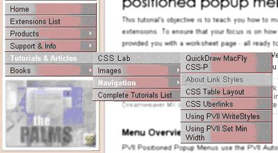
Fly-out menus come in three main shapes:
飞行菜单通常有三种主要类型:
1. Pop-up menus fly out from under your cursor wherever it is, often when you click your right mouse button.
弹出菜单通常会出现在鼠标点击的地方,只要点击鼠标的右键就会出现。
2. Drop-down menus display one option, while typically a small arrow to the right of the box invites you to click and bring more options into view.
下拉菜单只有一个选项,很典型的一种情况就是,一个向右的箭头把用户指引到有更多选项的区域。
3. Cascading menus - also called hierarchical menus - show you a new second or even third menu when you click on the first menu item. The best-known cascading menu lives underneath the Windows Start button.
层叠式菜单——也称为等级菜单,当你点击第一层菜单的时候,会出现第二、甚至第三层菜单。我们经常在Windows启动键的下面见到层叠式菜单。
The spread of browsers capable of displaying JavaScript and Dynamic HTML now allows almost anyone to drop flying menus into their Web sites. For many, the temptation to use the latest and fanciest technology has proven too great. And flying menus certainly do conserve valuable screen space. But with flying menus come tough, often under-recognised problems.
浏览器现在可以呈现JS和动态HTML,所以现在很多人弃用飞行菜单。最新颖、最奇特的技术对他们的诱惑很大,当然飞行菜单仍然有自己的存在空间,但这种菜单经常会带来意想不到的问题。
The worst of these problems afflicts pop-ups, drop-downs and cascading menus alike. All hide most of a site's options from the casual user.
弹出菜单、下拉菜单和层叠式菜单有一个共同的弊端:对不熟悉网站的用户来说,菜单会限制他们的选择。
Hiding options in drop-down and cascading menus is a problem even in repeated-use programs like Microsoft Word, whose users were for years shielded from desirable features such as mail merge. The Web magnifies this existing problem. Casual users - the bulk of the average site's audience - simply won't stop to study a site's interface for half an hour. So they ignore features which they might want, and options which the site might need them to explore. Nick Iozzo, a "cognitive designer" at the US Web design house Zefer, pointed out in a posting to the CHI-Web mailing list that most users leave drop-down menus at the default setting. His conclusion: use a drop-down only when you'd be happy for users to accept its default state. Otherwise, try links or radio buttons - anything which puts the navigation out in front of the user.
像Microsoft Word这样经常使用的程序,也会在下拉菜单和层叠式菜单的导航下,给用户造成一定的问题,用户可能会找不到一些常用的功能,例如:插入邮件的功能。现存的这些问题还会在网站上不断扩大。网站的大部分客户是临时性的,他们不会花半个小时时间去研究网站的设计,因此,在这种情况下,他们可能会忽视寻找的信息,也不会明白网站需要他们仔细寻找内容。Nick Iozzo,是美国网站设计室Zefer的一名设计师,在给CHI-web的邮件中指出:大多数用户会离开下拉式菜单的网站。他的结论是:在用户能够接收这种默认状态的情况下,才可以使用下拉菜单,否则,可以运用链接或单选按钮,或者是任何能为用户导航的设计。
But aside from hiding options, each type of flying menu suffers from specific problems when used for Web page navigation.
隐藏选项是上述飞行菜单的共同问题,除此之外,这三种菜单还都有各自的缺点。
The cursor pop-up (in Windows, the menu called by the right mouse-button) is wonderfully easy to use. After all, it's in the one spot on your screen that you can reach with absolute ease - the spot where your cursor is already sitting. But of course, your Web browser already sets that pop-up menu to useful tasks like letting you open a link in a new window. Using dynamic HTML, you can actually replace that pop-up menu with your own. Thankfully this is an idea too dumb for almost anyone to implement.
弹出菜单(在Windows中,点击鼠标右键出现菜单),使用起来是很容易。你只需要在屏幕上轻轻点一下鼠标,菜单就会出现,这对用户来说是轻而易举的。但是,网络浏览器已经具备了这样的功能,比如说,可以在新建窗口中建立新的链接。运用动态的HTML,可以取代弹出菜单,然而,值得我们高兴的是,没有几个人会这么做。
The drop-down menu suffers from a usability glitch of its own. If you own one of those wonderful mouses with a scrolling wheel, a twist of the wheel will change your menu choice - often without your knowledge.
下拉菜单在可用性方面存在问题。如果你的鼠标是有滚轮的,滚轮的转动会改变你的菜单选择,需要的内容就不容易找到。
But it's the cascading menu which really drives users crazy. For starters, Web-based cascading menus are impressively unpredictable. Some fly out as soon as the mouse passes over them; others appear only when you click. Some stay put when your mouse moves off them; others disappear. Compare, for instance, the Windows Start button, the navigation at msnbc.com and the menus at slate.com. Microsoft was involved in all of them; each behaves differently.
层叠式菜单有时真的可以让用户发疯。对第一次登录网站的用户来说,层叠式菜单的不可预知性让他们印象深刻。有些菜单在鼠标经过时自动跳出来,有些只有在点击之后才会突然消失;有些菜单在鼠标移开后不会变化,而有些会消失。比如说,你可以比较一下Windows启动键、msnbc.com上的导航系统,以及slate.com上的菜单,这些情况在微软系统中都会出现,表现形式各不相同。
The cascading menu's biggest weakness, though, is its demand that you repeatedly hit a small target - a target which will disappear if you miss it, or even if you take the wrong path to it. You often have to slide your mouse through two precise ninety-degree turns just to reach the second level of a cascading menu. Apple implements the idea better than Microsoft, but the fact remains that cascading menus are inherently tough to use. And most Web designers exacerbate the problem by using their beloved tiny text in those cascading menus. This isn't an interface; it's a computer game.
然而,层叠式菜单的一个最大缺点就是:在寻找内容的过程中,你需要不断点击一个个目标,如果错过其中的某一个,目标就会消失;或者如果寻找的路径不正确,就找不到目标内容。你经常需要把鼠标转动两个九十度,才能找到第二级菜单。在这个方面Apple公司比Microsoft公司设计地要好一点,但事实仍然是:这种菜单不方便用户操作。有些设计者,在层叠式菜单中加入喜欢的小文章,这样又增加了菜单的复杂性。要知道,这是网页不是电脑游戏。
My own dislike of cascading menus has been refined by years of watching users struggle with them in normal office and home environments. Interestingly, interface design expert Alan Cooper expresses the same view in his classic About Face:
看到用户在办公室或家中费力寻找网站内容的时候,我就会对层叠式菜单产生厌恶感,很有趣的是,网页设计专家 Alan Cooper在他的著作About Face中也表达了同样的观点:
"... Cascading menus move us into the nasty territory of nesting and hierarchies. Hierarchies are so natural to the mathematically inclined, but they are quite unnatural to the rest of us. The temptation to make menus hierarchical is nearly unavoidable for most programmers ...
... There are occasionally enough items on a menu to justify putting some of the more obscure ones onto a second level, but I would consider it an idiom of last resort. I would make sure not to use cascading menus for anything that might be used frequently ...
In Windows .. the poor Start button is so overloaded with hierarchical menus that even I find it jerky and unresponsive, and I'm a pretty good mouser ..."
层叠式菜单让我们在浏览网站时,花费精力一层又一层地寻找内容。在数学中利用等级是正常的,但在其它的领域中利用,并不是很正常。所有的程序员都应该避免设计分等级的菜单。有时候,在第二层菜单中加入一些比较模糊的内容确实可以使菜单更丰富,但我认为,这不是设计者首先要考虑的。我不会在经常使用的内容中设置层叠式餐单。在windows中,启动按钮有那么多层菜单,所以它反映迟钝,对我这样擅长使用鼠标的人都这样。
When do flying menus work on the Web? On sites such as Jupiter Communications, where the content is strongly hierarchical and the user base is strongly motivated to find the content - they'll usually be paying thousands of dollars for it. On sites where you'd be happy to leave the selected item as the default. And on those rare pages where space truly is at an absolute premium. But in many cases - for instance, where the user must nominate her nationality - they can be replaced by scrolling list boxes that let the user see half a dozen options.
飞行菜单什么时候才可以发挥自己的功能呢?在Jupiter Communication这样的网站上就可以使用,这个网站的内容层次性很强,并且网站的用户群渴望得到网站的内容,有时,甚至不惜支付成千上万美金。在这样的网站上,你可以把一些条款设置为隐藏的内容,这些珍贵网页的空间确实非常有价值。在很多情况下,比如说,用户只有在注册了自己的国籍以后,网站才会出现一些列表框,允许其查看另外的选项。
Once you realise the dangers of flying menus, you have to confront the truly difficult issue of Web site navigation. What will your users most want to do at any given time? What should you show them? To answer that, you have to start watching what your traffic is doing, just like the people who put up the road signs. But eventually, you'll be able to send most of your users straight on down the highway - and they'll never have to stop and click around to find out where to go.
意识到飞行菜单的缺点以后,需要处理网站导航系统出现的各种问题。用户登录网站以后,最想找到什么内容?网站会给用户提供什么内容?要回答这个问题,就必须像树立路标的人一样,仔细观察用户的一举一动。最后,必须保证用户在高速公路上径直行驶,而不能迫使他们停下来寻找正确的方向。
 评论 (0) All
