当前位置: 首页 > 网络学院 > 设计教程 > 设计理念 > 运用对比方法设计网站的3条建议
If you have a website, it needs to grab attention. You have to catch a visitor's interest and make him or her want to delve into your site. Otherwise, the site won't do you much good, no matter how much traffic you're getting.
网站需要能够吸引用户的注意力,并且能够吸引用户浏览网站内容。如果这一点做不到,不管网站人流量是多少,网站都不会带给你太多的利益
If visitors land on a page that is visually uninteresting, you will fail to capture their attention. If everything on your pages receives the same amount of visual importance, visitors are likely to be bored and unfocused.
浏览者对视觉吸引力差的网页没有兴趣,但如果网页中的每项内容视觉吸引力都很强,网站浏览者也会感到无聊,因为网站没有突出重点内容。
So how do you make your site stand out visually? Employ the principle of contrast. The principle goes like this:
如何设计视觉效果突出的网站呢?可以运用对比原理,具体运用方法如下:
To create strong visual impact in your pages, make some things stand out. Big time.
创建具有视觉冲击力的网页,突出某项内容,这是最好的方法。
Add variation by visually emphasizing differences between items. If two elements don't look the same, make them look really different. If something is important, give it extra visual weight.
通过强调内容之间视觉效果的差异,产生对比效果。如果两项内容外观设计不同,那就要完全不同;如果某项内容很重要,你就需要在视觉上重点突出它。
Contrast works by creating sharp distinction between two items. The end result is to emphasize one item over the other, which makes that item stand out. This adds interest to your pages. It also helps organize and prioritize elements, and it focuses visitors in the specific direction you want them to go.
突出两项内容之间的巨大差异,会产生对比效果。这样会突出强调两项内容之间的一项,也就增加了网站吸引力。同时,这样也会使网站内容重点突出、主次分明,便于网站访问者浏览,能够引导访问者的浏览方向。
When you use the principle in your website, visitors are immediately drawn to the item that has the most contrast from everything else. By using contrast, you can keep your visitors from getting distracted and wandering all over the page. You'll be able to keep them tuned to the most important things.
网站中利用这项设计原则之后,访问者会立即对最突出的内容所吸引。通过对比,访问者浏览顺序会很有规则,不会毫无头绪,他们会注意网页最重要的内容。
If your pages don't use strong contrasts, they will appear dull and uninteresting. A page that doesn't have distinctions between elements lacks focus, because there is no clear place for the eye to stop. It's much harder for visitors to get excited about a page that looks boring than a page where certain elements leap out and capture interest.
如果没有利用强烈的对比,网页就会显得呆滞、无趣。内容之间缺少对比的网页,是缺少视觉吸引力的网页,因为访问者找不到重点,这样他们也不会对无趣的网页产生兴奋感,或许他们会登录内容层次分明、视觉效果好的网站。
How can you use contrasts? Here are a few ways:
如何产生对比效果呢?下面介绍几种方法:
1. Color
1. 颜色
Color is a powerful way to establish the importance of one element over another. If you need something on a page to stand out, infuse it with some vibrant color. Usually, you should make it a brighter or stronger color than everything around it. You can do this by changing the color of the text, by placing a colored background behind the element you want to emphasize, or using a brightly-colored image or button.
颜色是产生强调效果的重要方法。如果需要突出网页的某项内容,可以运用与其它内容不同的颜色。通常,这些内容的颜色应该比其它内容更明亮、更强烈。这时你可以变换文本颜色,或者设置彩色背景,或者运用色彩强烈的图片、按钮,来突出重点内容
Using contrasts in color doesn't always mean you need to use bright or "loud" colors. If the rest of your page uses subdued colors, even a gentle color contrast may be sufficient.
运用对比颜色并不一定必须使用亮色或者令人眼花缭乱的颜色。如果网页其它内容颜色柔和,这时只需要产生柔和的对比就可以了
2. Size
2. 尺寸
If you're going to make a contrast in size, make a serious contrast. Most people do not make size differences significant enough. Failure to make a strong distinction results in a page that looks cluttered and messy.
进行尺寸对比时,对比效果一定要强烈。有些网站的尺寸对比就不够强烈,所以没有产生好的效果,反而使网页外观混乱、不清晰。
The most common place to use size contrasts is in text. For example, when you make a heading bigger than your body copy, you've used a size contrast. However, you can also contrast size with other items. If you have a variety of pictures on a page, you can make one significantly bigger.
文章中经常会运用尺寸对比,比如说,标题的字体要比内容字体大,这时需要运用尺寸对比。然而,内容之间也可以与用尺寸对比,网页中的图片如果很多,你可以让其中一张尺寸变大,产生强调作用。
3. Direction
3. 方向
You can create contrast by varying the direction (horizontally and vertically) of elements in a page. This contrast is more subtle and not quite as common as color and size.
你可以通过改变方向产生对比效果(横向、纵向都可以),这种对比更微妙,不同于一般的颜色与尺寸对比。
Contrasting direction doesn't necessarily mean to turn a word on its side so it is pointing upward. You could do that, but there are other ways that don't impede readability. You can contrast a long horizontal header that spans the page with two tall, narrower columns of pictures or copy underneath it. You can contrast a thin vertical column of text with horizontal rules (dividing lines) to separate different parts.
方向对比并不是要求改变词语字母排列方向,当然你可以这样做,但会妨碍用户阅读内容。你可以运用两栏高、窄的图片或者其它内容与横向设置的标题产生对比;也可以运用水平分割线与垂直的文本产生对比,这样可以区分不同的内容。
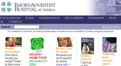
For example, take a look at Emoryadventist.org. Notice that the header at the top is wide and the four columns of text are narrow and are divided by vertical lines. The page would be much less interesting if everything on the page had a horizontal direction.
你可以浏览Emoryadventist.org,会发现顶部标题很宽,但下面四项内容很窄,并且被垂直线分开。如果网页中每项内容都是垂直放置的,就会缺乏视觉吸引力。
Finally, two important reminders on using contrast:
最后,运用对比时,记住以下两点:
First, if you emphasize everything, nothing stands out. Be careful not to use so much contrast that your page is overpowering or cluttered. Contrast has to be used wisely in order to be effective.
首先,突出全部内容,就会淹没全部内容。同时不要运用太多的对比,否则会使网页很混乱。请记住:对比需要产生令人印象深刻的效果。
Second, don't be a wimp. If your contrasts are too mundane, you'll appear dull and uninteresting. Be daring!
其次,对比的使用要大胆,否则网页会枯燥、无趣。
 设计理念 中的 运用对比方法设计网站的3条建议


 评论 (0)